overview
Background
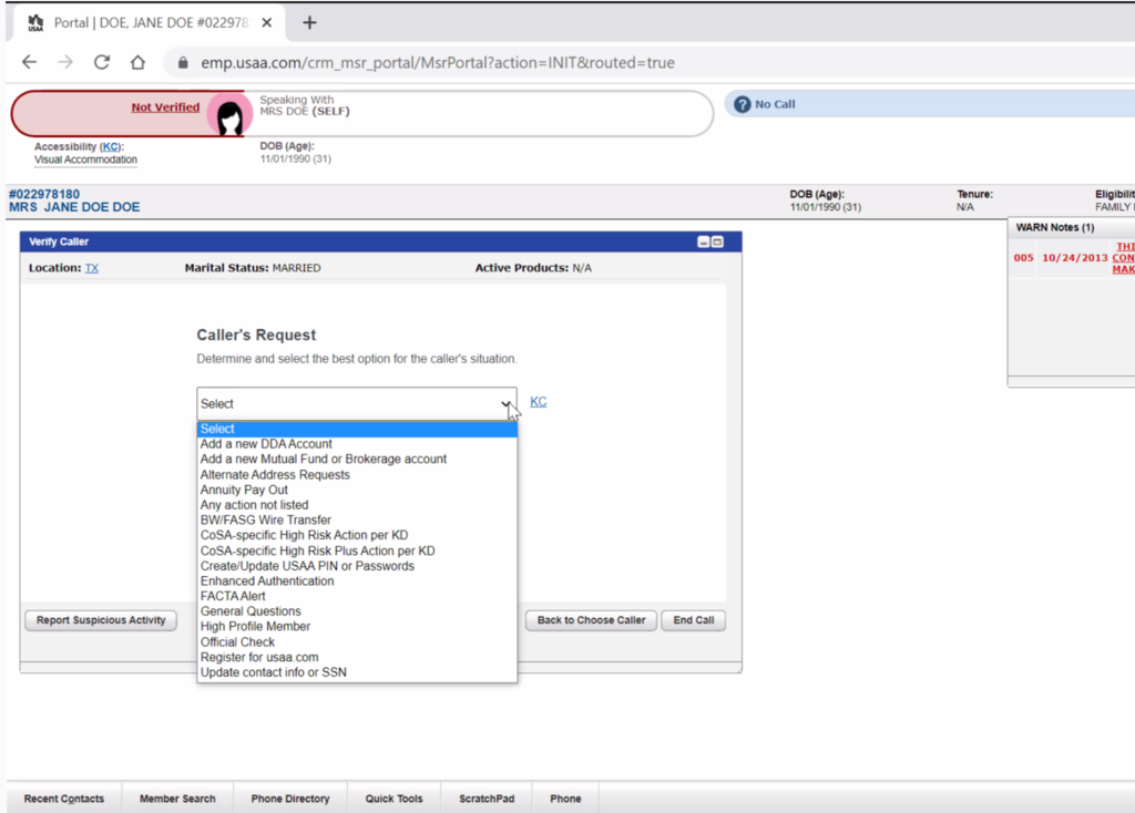
USAA’s Member Service Representatives (MSRs) assist hundreds of callers everyday, and their first step is to ensure that the caller's identity is verified and sensitive information is protected. To do so, MSRs need to understand a caller's request and then decide what level of authentication is required.
Once they’ve determined the request type, MSRs use a Member Authorization Tool (MAT) to manually select from a list of options presented to them. They are then presented with a set of questions based on the selection made, which they must answer to assist the caller. These steps are crucial for providing effective and efficient customer service while maintaining security and privacy.
Problem
This was a manual, procedurally driven process that sometimes resulted in QA errors and potential compliance violations. We want to move to an automated process at the transaction level. Eventually, this will all happen in the back end, but MSRs still need the ability to access General Questions, which is located in the dropdown within the Step Up.
INTRODUCTION
The screen where MSRs choose Caller's Request
We want to remove this screen but still make General Questions available
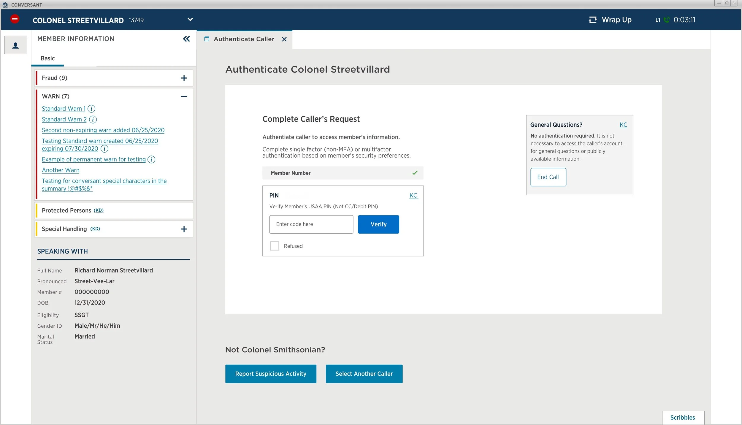
This is the screen MSRs see after choosing General Questions from the drop down menu
<< Insert role, timeline, etc >>
Partner feedback
“Thank you Sherry for all the hard work on this crazy effort. You did a great job staying up with all the changes and working quickly to make adjustments. We appreciate you!”
IDEATION
Overall Goals
Allow the system to determine authentication plan (Today it is partially driven by a drop down menu selection)
Remove the Step Up authentication flow
Create the Transaction Authorization flow
Each transaction experience will have the UI built into their flow (individual LoB will build and own
In Scope/Requirements
Removing the Caller's Request drop down menu
Maintain the ability to not authenticate a member in order to provide general questions/information
Update the thumbnail in Portal to remove the link that relaunches MMA/MMAT
Redesign the general questions process without a dropdown
Context: Calls that don't require authentication (General Questions)
Design will need to determine how the MSR can get to General Questions without the Caller's Request screen (can it be added somewhere else?)
Assumptions
MSRs will be notified of the changes and trained before rollout
Each LoB design team will own the UI for their specific transactions
Entire conversation will happen in Conversant on one tab
DESIGN Prototypes
We explore the scope, constraints, and resources needed to bring our ideas to reality. We work with our design, business and engineering partners to iterate on a feasible and realistic experience. Simultaneously, we test lo-fi and hi-fi prototypes with members to ensure the validity of the design.
At the time, MSRs were in the process of transitioning from Portal (the old system) to Conversant, so I had to design for both.
IDEATION
Cross-functional team collaboration
Cross functional collaboration with the MSR design team to leverage their expertise and come together to work toward a common goal. Through Mural we were able to brainstorm solutions as a team and captured questions to keep the momentum going.
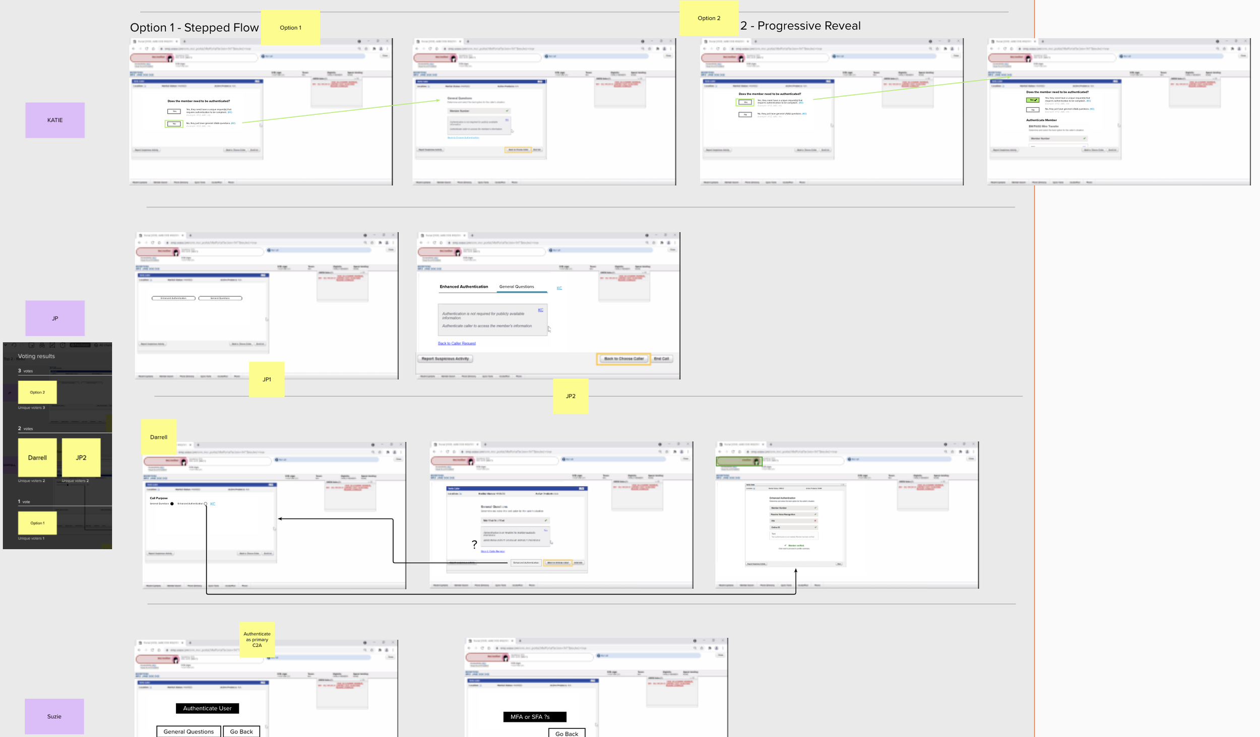
Design Iteration 1
VERSION 1
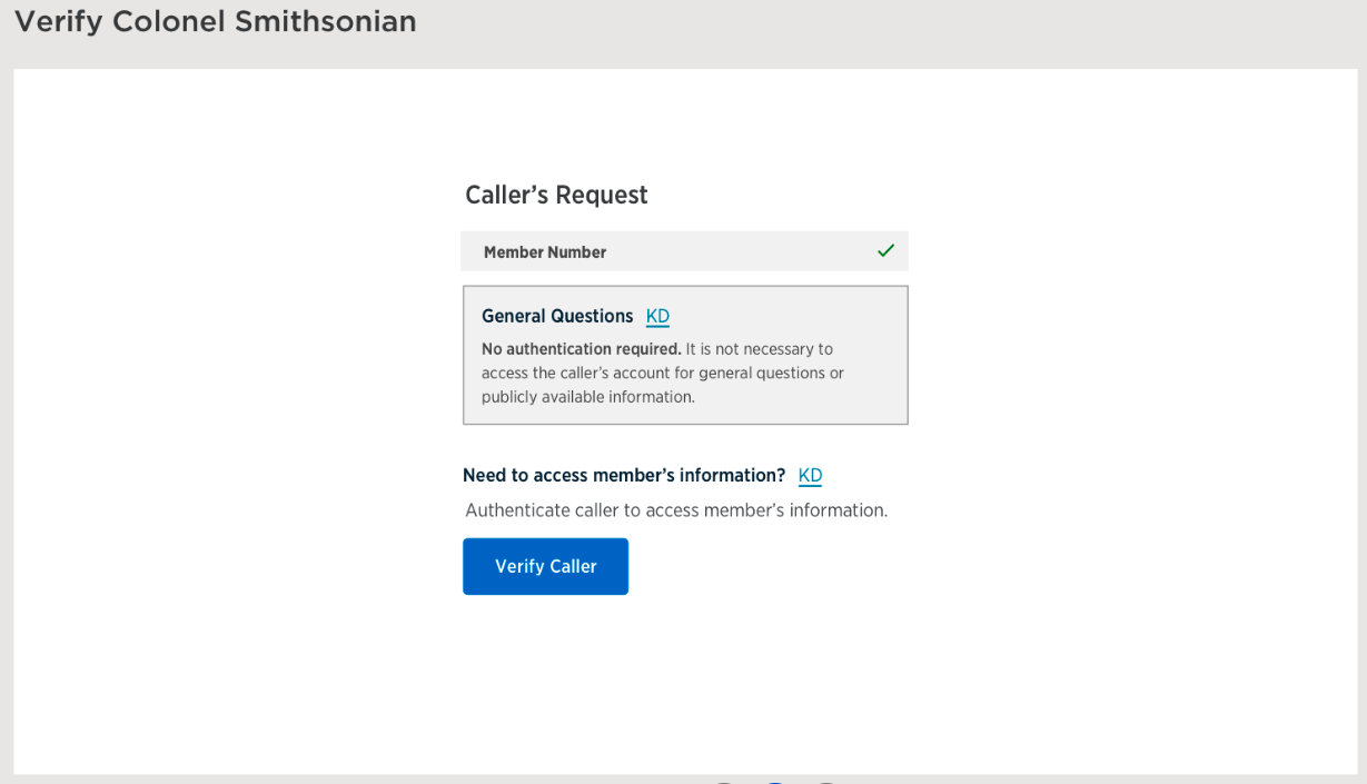
Single column design showing the two options that will remain from the previous dropdown menu: Authentication and General Questions. The two main CTAs are (1) an Authenticate button, which will launch the verification questions and (2) a link to launch Knowledge Central to answer any general questions from the caller, which disappears once the authentication flow begins.
Make it stand out
Whatever it is, the way you tell your story online can make all the difference.

VERSION 2
To make both Authentication and General Question information available, we explored designs using a tabbing component to allow MSRs to toggle between information without losing their place within the flow.
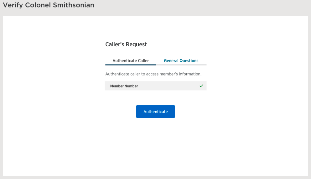
The first tab has one CTA, an Authenticate button to start the flow.
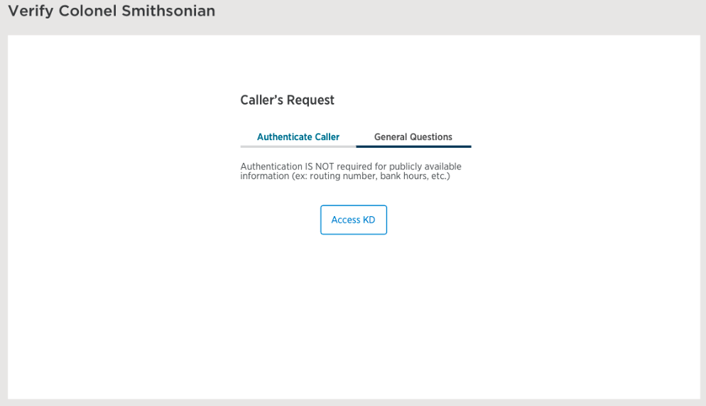
The second tab has one CTA, an Access KD button.
DECISIONS
Version 2 was the preferred design by partners for it's flexibility and persistent information.
Use Authenticate vs Verify throughout for consistency.
Design Iteration 2
VERSION 1
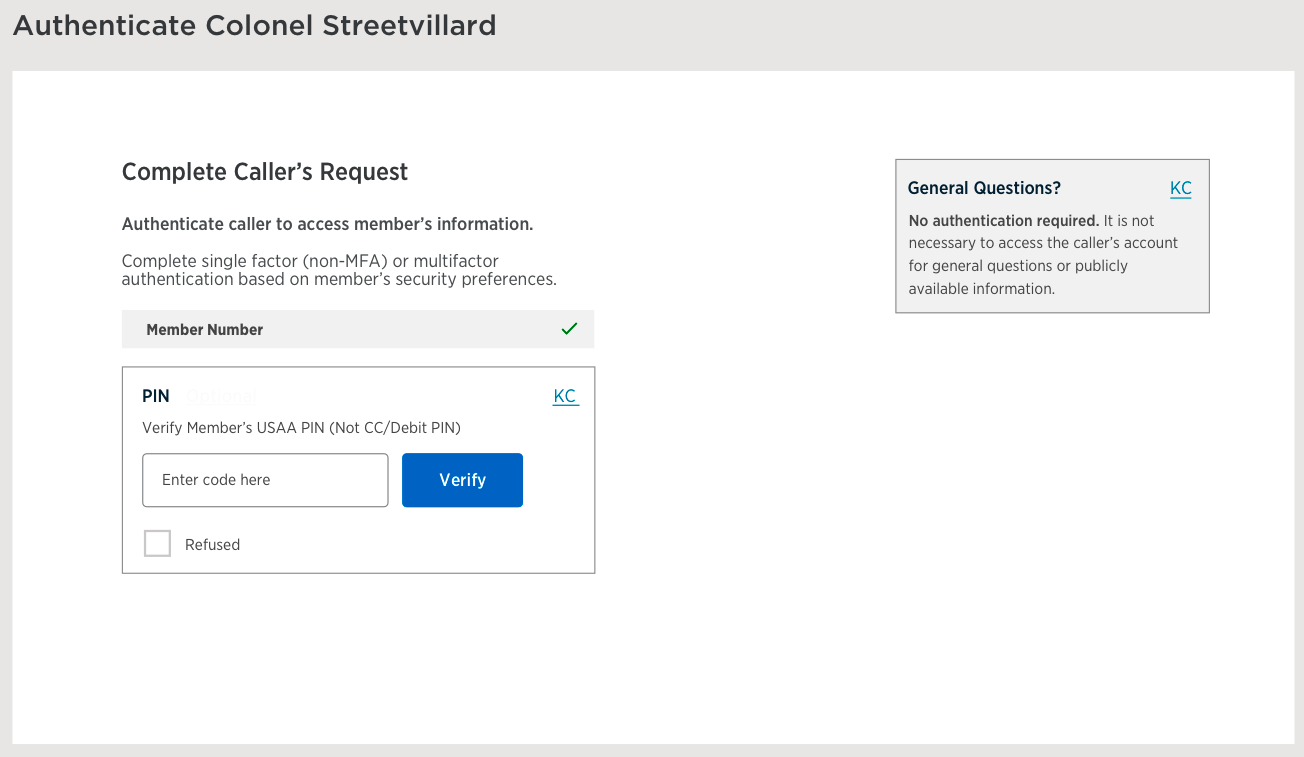
After further discussion, design opted to remove the tabbing component because it adds clicks and makes it seem like they have equal importance; data shows that only ~70 of every 50,000 authentication sessions interact with General Questions.
We created a 2-column design to maintain focus on Authentication flow on the left and to provide information about General Questions to the right for less prominence. The MSR will have to click the Authenticate button to start the flow, where the informational text disappears on the next screen.

VERSION 2
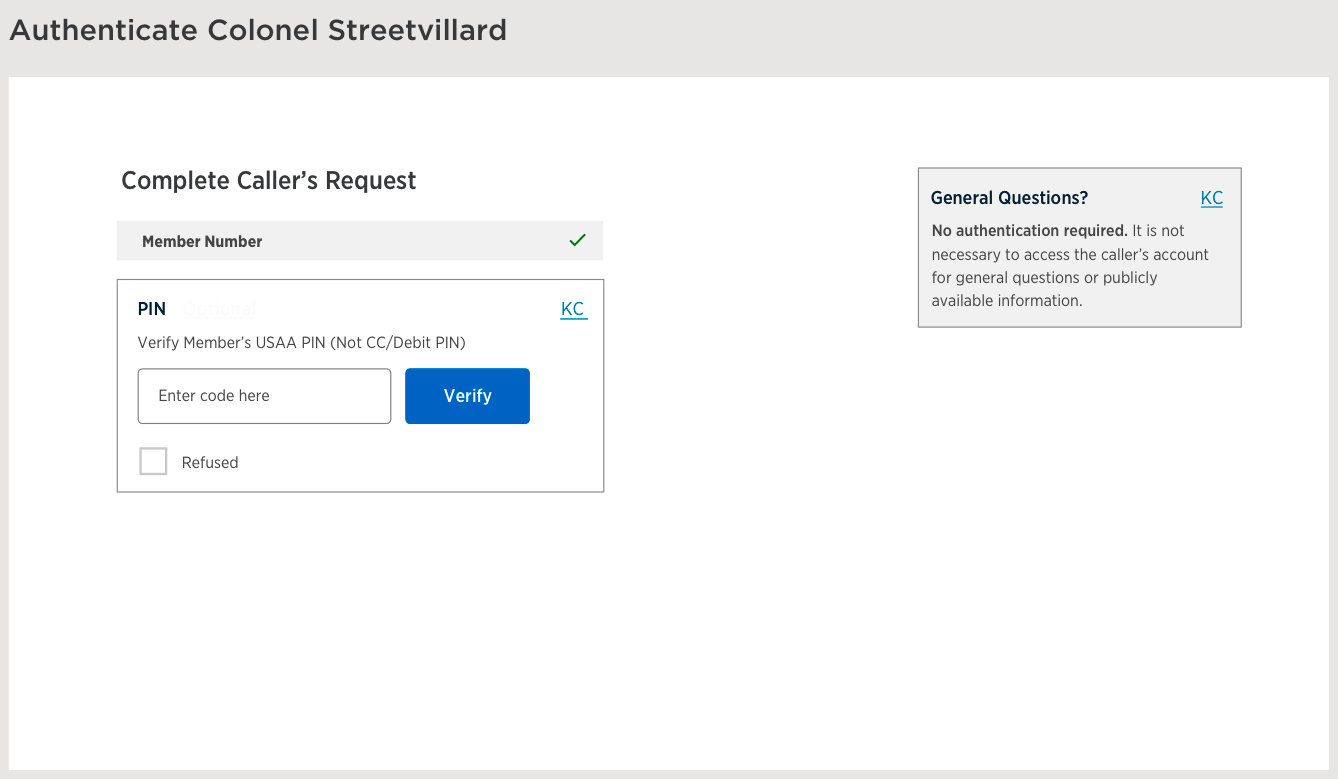
Similar to version 1, except MSR will automatically be shown the Authentication flow and the informational text is shown throughout the experience.
DECISIONS
Add End Call button to the General Questions box.
Test both designs with MSR.
Design Iteration 3
Updated iteration 2 of designs to include an End Call button in the General Questions box. Agreement was made to move forward with MSR testing to determine preferred designs.
Version 1 Start - With Authentication Button
Version 2 Start - Automatically Show Questions
METHODOLOGY
Focus group
5 MSR participants
4 Design variations
Conversant with Authenticate button
Conversant without Authenticate button
Portal with Authenticate button
Portal without Authenticate button
HIGH-LEVEL RESEARCH THEMES
MSRs rarely use general questions as member usually have more questions
MSRs may be over authenticating members due to fear of not hitting compliance requirements
The current drop down list doesn't have an option for Claims MSRs
Most MSRs stated they preferred the page where automatically went into authenticating members vs. having to select an the authenticate button.
All MSRs assumed there will only be one way to authenticate member going forward based off the prototype and wanted additional authentication options than what was available.
All MSRs stated to remove the end button under General Questions
Consider modifying radio language from refused to "member does not have information” or similar
TEST PLAN
Platforms
Portal
Conversant
Objectives
Determine general usability of experience
Evaluate overall flow of Transaction Authorization process and how it compares to MSR expectations
Does automation of authentication truly help MSR complete tasks more efficiently
Does skipping Caller Request drop down interfere with MSR mental model
Determine how MSRs feel about no longer having the drop down options
Identify pain points
Identify any places instructions and explanations could be more clear
Evaluate intuitiveness of General Question location alternatives
So we've narrowed it down to a couple different directions (linear vs toggle design). Mostly we want to determine how MSRs feel about the new flows and what concerns they may have so we can figure out if we're ok to move forward with implementation, need to add additional information/instructions, provide training, or go with a different design altogether
Participants:
6-10 MSRs to walk through prototype using MSR Lab usability guide.
Research guide (Focus Group)
Discovery question: How do you handle a call when a member calls in to ask a question like USAA's hours of operation?
Show current state screenshots to ground individuals in what we are talking about.Show participants first prototype. "Imagine a member has been partially identified through IVR, this is the page that populates and you’re expected to complete authentication."
it's case by case
pull up KC article that gives us bank hours
if don't need verification, answer question and then transfer
while pulling up KC, will ask what they want to accomplish
Will ask why they need to know general question, what they're trying to accomplish with that question
won't make them wait 3 mins/ask questions just to ask about hours
GQ dropdown - I didn't even know it was there (claims)
any and all other for claims
Never explored the other ones
clicks No other action needed bc that's what they were told to click on
Someone on team tells them what to do
There's not one specific option for claims general questions
- Verify - knee jerk reaction, do it anyway (verify)
Will automatically do HRP authenticated even if only HR bc
been told to over-authenticate to avoid compliance risk
problem is sometimes people can't HRP authenticate
will have to disconnect call if they fail HRP but would have passed HR
cumbersome to authenticate senior citizens --> won't do auto enhanced auth for this reason
Conversant 1 questions - with Auth button
What are your thoughts on this new experience?
looks empty/lots of blank white space
eyes would eventually get used to it if seen enough
likes GQ no auth required
Minimalist in a good way
more context needed to know what's going on
Might click end call before call needs to be ended
can be click happy (maybe put confirm button?)
not clear what the button does
confusing to have end call in same box as GQ
don't have button here
Button would cause more hangups than necessary
too easy to disconnect calls
very rare that you get just a general question
What do you think about the change?
Anything stand out to you?
What steps would you expect to take if the member was looking for USAA's routing number?
Click KC question
Answer question and then probably click end call
worry that they would click button before they're done (click happy)
What steps would you expect to take if the member wanted to take update their mailing address?
Transfer bc they can't do that (in claims)
or auth and then transfer
won't auth first bc don't know if HR or HRP needed
Portal 1 questions - doesn't have auth button
What are your thoughts on this new experience?
Like it better than the other one
still don't like end call button
everything else looks similar enough that they can handle it
Looks cleaner
but redundant bc of end call button
What do you think about the change? (vs current)
looks very similar/familiar
taking steps away is always nice/great
Thoughts on taking away dropdown
claims has lowest level of verification so this is great
like that it's simpler not having to choose from dropdown
Q: are questions determined by department? Ex HR vs HRP
Not confusing in any way
similar to what they're doing
They need more options bc some elder members can't do OTC
Anything stand out to you?
Refused should be something "friendlier" - don't have it
What steps would you expect to take if the member was looking for USAA's routing number?
What steps would you expect to take if the member wanted to take update their mailing address?
Click through each prototype for MSRs.
Conversant 1
Now that we clicked through everything, what are your thoughts?
What do you think about the change compared to current state?
If this is how you are expected to verify members going forward, what would you change?
Is there anything missing from this process?
"Here's a different option." Click through the second prototype.
Conversant 2
What are your thoughts?
don't think authenticate button is necessary
otherwise it's the same as what we're doing now
another button we don't need
dont mind auth button if it starts the flow
4 out of 5 prefer no auth button, 1 doesn't mind button (didn't prefer it necessarily)
Anything stand out to you?
If this is how you are expected to verify members going forward, what would you change?
When it gets to OTC, show other options before it
have other options available before clicking refused button
if other options are showing, they can reassure member that there are other options
Is there anything missing from this process?
Switch to Portal prototype.
Other feedback
Want button that is specifically for department working in bc some members work in multiple departments
Issues with having to reauthenticate if need HRP auth
Members complain about re-auth
Question
- how do you expect to end call
PROTOTYPING
Design Iteration - FINAL
Information about design components and functionality.
Component
Description
LAYOUT
1. Conversant vs Portal
The layouts will be slightly different due to Conversant having a larger iFrame area than Portal. The sizing below are estimates in relation to iFrame size and can be adjusted if using a 12-column grid.
LANDING PAGE - BEGIN FLOW
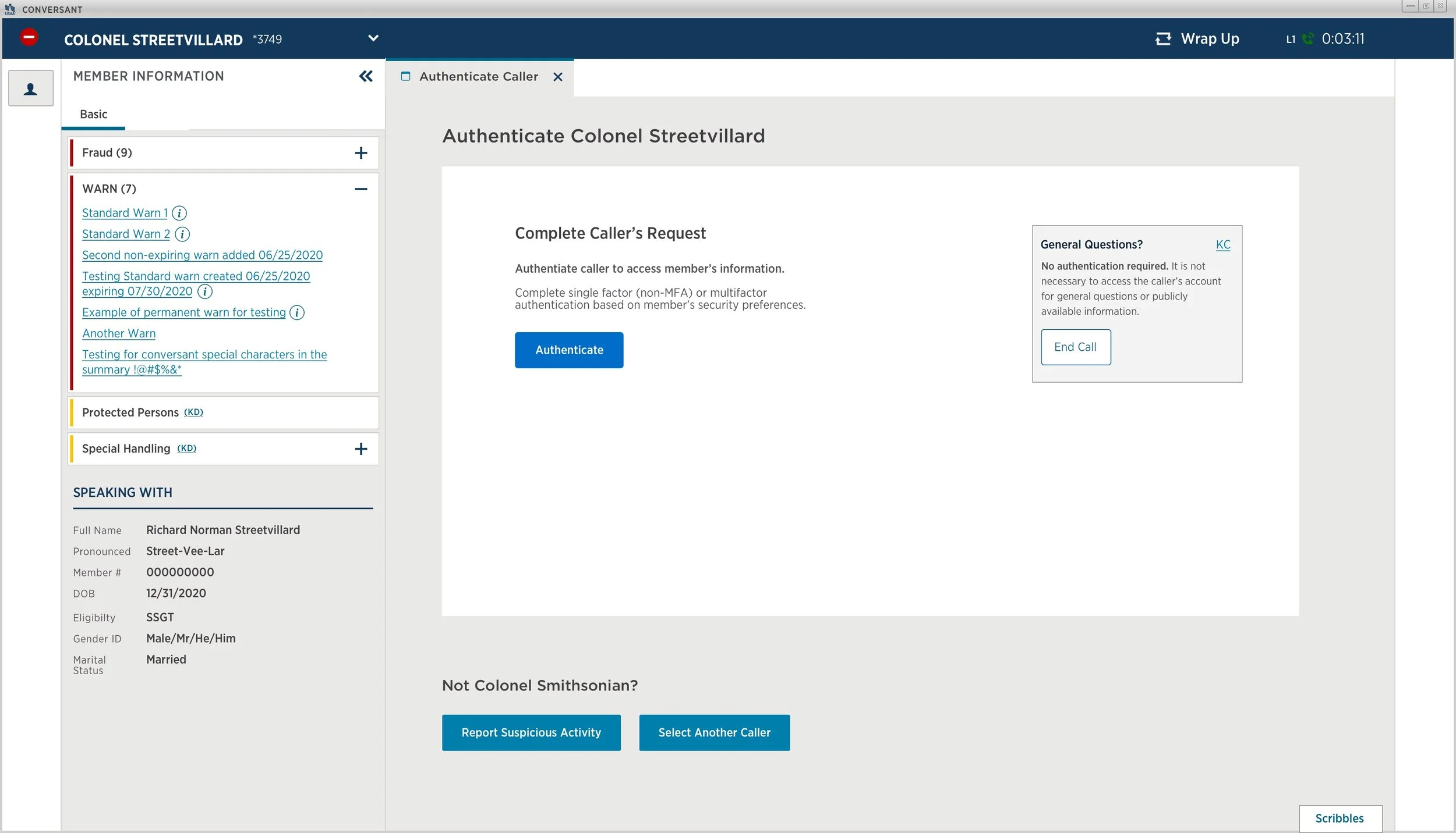
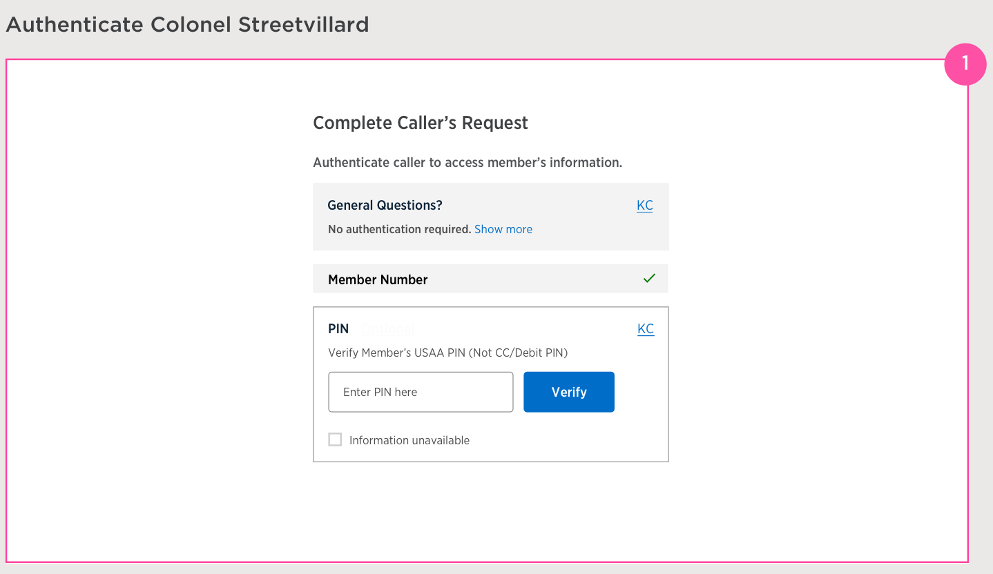
2. Authentication Column
Immediately upon connecting with a member who has been partially identified through IVR, MSRs are shown:
Information about General Questions with KC link
Authenticators that have already been supplied or attempted in a gray box below the informational text with either a green check mark (success) or red X (failed)
The next authentication question based on member security preferences (SFA or MFA)
Note: Authentication flow begins once the MSR begins interacting with the input fields.
Recommended
Alternative
3. General Questions Informational Text
Informational text and a link to Knowledge Central will be shown in a gray box and will be persistent on all MMAT windows until authentication is completed.
Remove from confirmation page (authentication/verification complete)
KC link should open a new tab
RECOMMENDED
Based on MSR testing feedback and overall usage, design recommends not including an End Call button to this container as it introduces the risk of accidental hangups by MSRs.
ALTERNATIVE
If a separate CTA is needed for GQ calls, use a discreet link to avoid accidental clicks and include text explaining the purpose of the link.
On hover - bold and underline text to indicate that it is clickable
4. Combined box for multiple delivery options
Authenticator options will be combined within the same box
The same options with multiple delivery options will be stacked with radio buttons to select and reveal a dropdown below the selection
If only one delivery method is available, immediately reveal input field
Primary number or email will always be pre-selected
The Send button will be disabled until a radio button is clicked
The checkbox with Information unavailable will replace the previous None Available option
Related but different options (ex: CyberCode Token) will be in a separate box and revealed when MSR clicks Show more options button
5. Show multiple numbers and emails
A dropdown menu will be revealed after MSR chooses the method of delivery. The primary number or email will be pre-selected with the option to choose a different number or email.
6. Resend button
The resend button will be disabled for a few seconds before it turns blue and becomes clickable in the event the code needs to be sent again.
7. Input field and Choose another option button
If MSR gets here after clicking the radio button, provide a button to go to the previous screen to allow them to choose a different delivery method, option, or to choose Information unavailable.
If the caller only has one delivery option, immediately show the input field and include a checkbox with Information unavailable and go to the next available authentication question.

Redlining
01 Mar 2022
Continue with Toggle vs Linear design flow. Once member is authenticated, MSR will no longer be able to launch MMAT by clicking on the member thumbnail on the top left of the Conversant or Portal window.
Determine the need for an additional page with Authenticate button to initiate flow through MSR testing or based on past research.
Use Authenticate instead of Verify throughout flow for consistency with current experience.
10 Mar 2022
Design presented updated 2-column designs, removing tabs in order to reduce clicking. The Authentication flow is on the left and persistent General Questions box with informational text on the right.
After review, it was agreed that an End Call button was needed for the General Questions box.
Developers need a way to log calls that were ended because no authentication was required, only general questions.
22 Mar 2022
Large End Call button is removed after MSR feedback determined that it could result in accidental hangups.
If needed for tracking metrics, add discreet link text to end the call.
Design based on MSR research feedback
29 Mar 2022
Shared research with partners and design updates based on feedback:
Add end call link
Change wording to replace "Refused"
04 Apr 2022
Developer handoff meeting
Designs approved for both Conversant and Portal
Design needs to provide comps for a resend button for OTC
Design needs to provide comps for showing multiple phone numbers and emails
12 Apr 2022
The window size is too small for Portal to have a 2-column design, so we need to go back to 1 column and remove verbiage for authentication