InfoSec Front Door Refresh – Trend‑Driven Case Study
-
Description text goes hereWe discovered 64 forms across at least five platforms, some linking to retired pages and outdated wikis. Naming conventions were inconsistent and there was no single entry point, leaving customers lost and frustrated—I literally needed a treasure map to find the right form!
-
Description text goes hereWe didn't design in a vacuum. Using Slack channels, search logs and informal interviews with developers and designers, we gathered stories about confusion and friction. Comments like “I don’t know who to talk to for help” and “I spend more time filling out forms than coding” told us we were on the right track.
-
We consolidated 64 scattered forms into one "front door" with clear categories and intuitive names. Aligning with stakeholders and using data to prioritize, we cut entry points from dozens to one, slashed confused support tickets, and gave engineers back precious coding time. And yes, users now know exactly which form to use without a treasure map.We consolidated 64 scattered forms into a single "front door" with clear categories and intuitive names. By aligning with stakeholders and using data to prioritize, we cut entry points from dozens to one, reduced confused tickets, and gave engineers back precious coding time. And yes, users now know exactly which form to use without needing a treasure map.We consolidated 64 scattered forms into a single "front door" experience with clear categories and intuitive names. By aligning with stakeholders and using data to prioritize, we cut entry points from dozens to one, reduced confused tickets, and gave engineers back precious coding time. And yes, users now know exactly which form to use without needing a treasure map.Description text goes here
Objective & Role: The InfoSec team’s request portal was a labyrinth of 64 forms scattered across five platforms—broken links and names only a security engineer could love. As the lead UX designer (and chief form wrangler), I partnered with 28 teams to audit every form, crowdsource feedback through Slack and guerrilla interviews, and design a single, accessible front door for all requests. By the end of the project, we reduced the number of entry points, clarified names, and gave our users a one‑stop shop that didn’t require a cryptographer’s decoder ring.
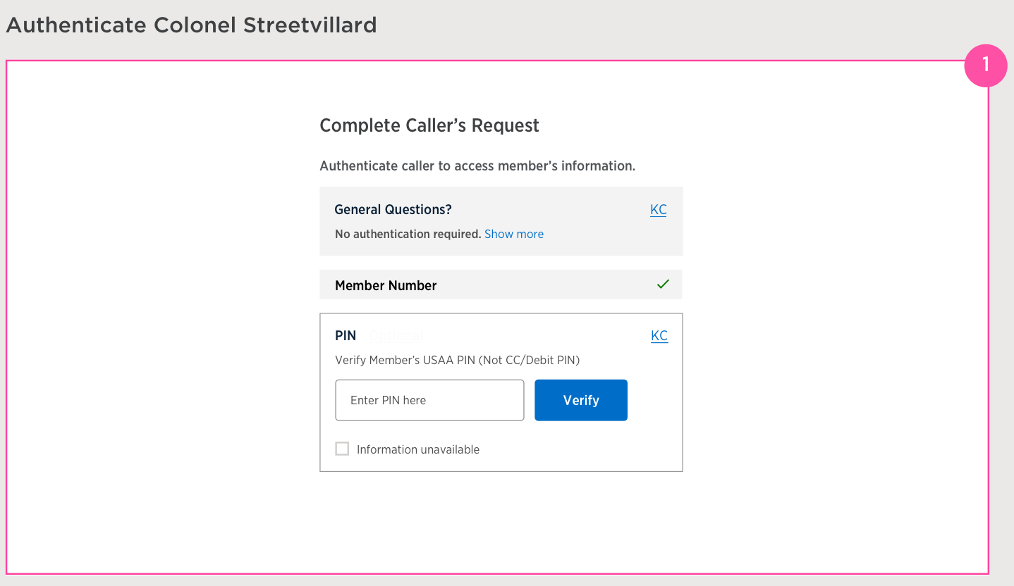
Screenshot of an early InfoSec request form interface used to illustrate the problem: multiple fields and unclear options.