DISCOVER
This was InfoSec’s third attempt to redesign their front door, the last time being over 2 years ago. In order to be successful, we wanted to start with finding out as much information about the current state as possible.
Content inventory
How many forms are there?
How are users getting there?
We audited the current front doors and then consolidated the data.
We clicked through more than 150 links and combined notes on a spreadsheet. This allowed us to sort and filter unique links, remove redundancies, and make stakeholders aware of errors.
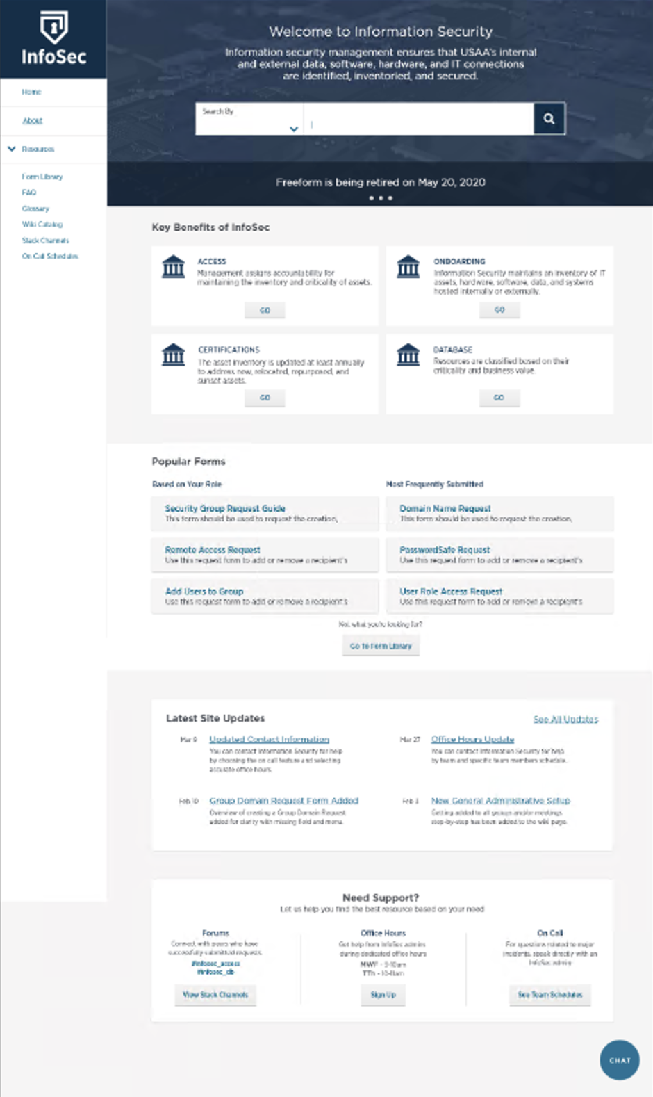
Variations of InfoSec front doors:
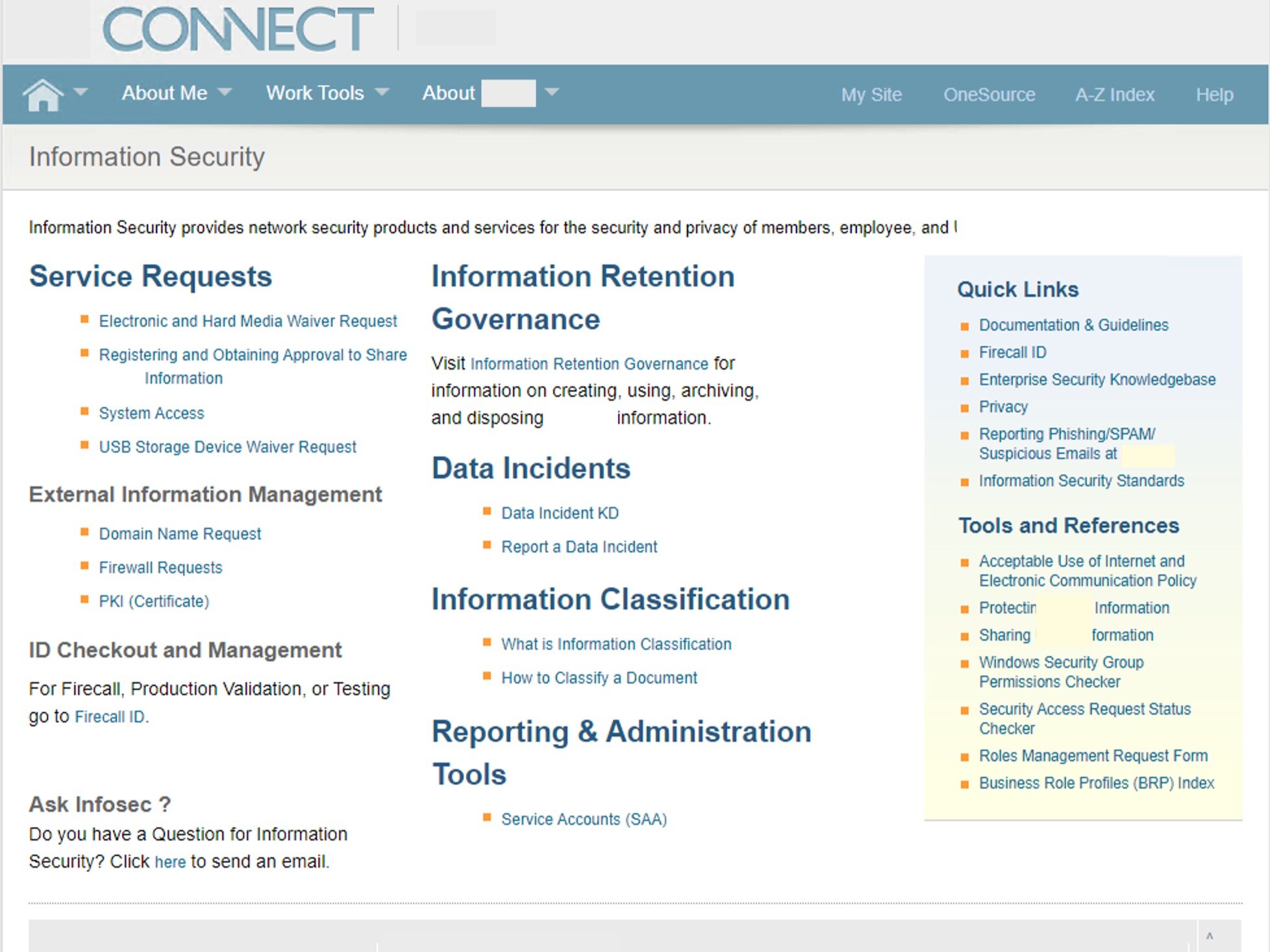
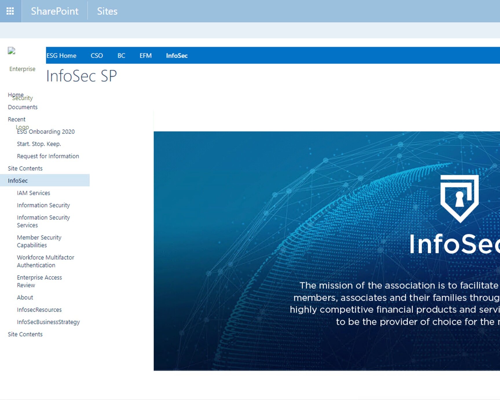
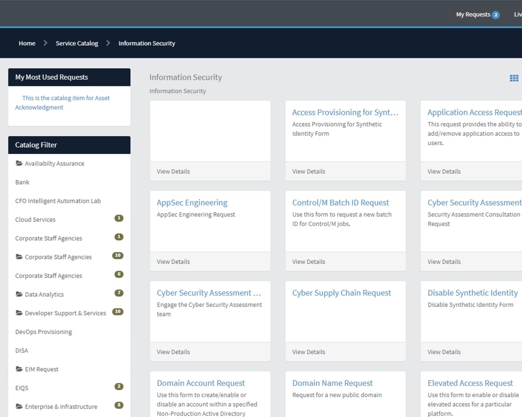
Activity Summary
We clicked on A LOT of links. This is what we found:
64 forms on at least five different platforms
Links to error pages, retired forms, and outdated wikis
Inconsistent naming conventions
Crowdsourcing
What are customers saying?
We gathered feedback from Slack channels and informal interviews to understand user pain points.
After seeing questions in Slack channels about design tools, I did a keyword search of InfoSec terms to see if something similar was happening. I later sent direct messages to some of customers (mostly developers) who posted InfoSec questions to ask about their experience. I also interviewed other designers who recently submitted InfoSec requests.
Examples of keyword search results that we anonymized before synthesizing:
Activity Summary
I’m not afraid to get in people’s business so I conducted guerilla research and this is what I learned:
Customers don’t know when requests will be completed
They don’t know who to talk to for help
They don’t know why their requests are rejected
InfoSec forms are confusing
The list goes on, but those were the big ones.
Heuristic evaluation
Why are users making mistakes?
Evaluate form design to identify trends and establish priority.
We were able to identify over 100 design violations and assigned them severity scores. I worked with teammates to organize the findings and come up with a plan to fix the most prominent and high priority design violations.
Activity Summary
We picked apart some forms to see why customers kept messing up and this is what we saw:
Too much jargon
No form descriptions
Vague or confusing instructions
Requires irrelevant information
Autocomplete hinders rather than helps
Does not state restrictions until after completion (ex: only managers can submit)
Comparative analysis
What companies are doing this well?
Address user pain points from previous activities.
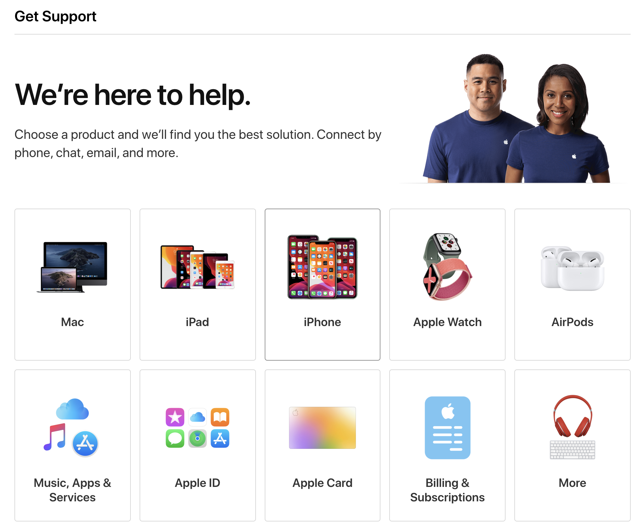
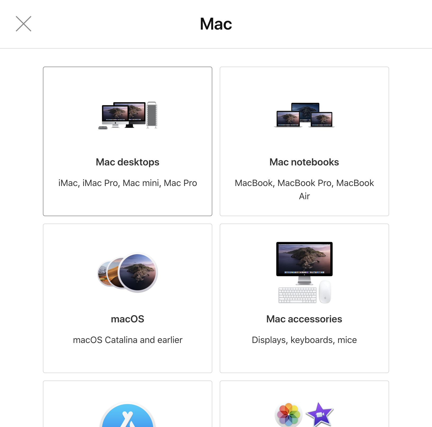
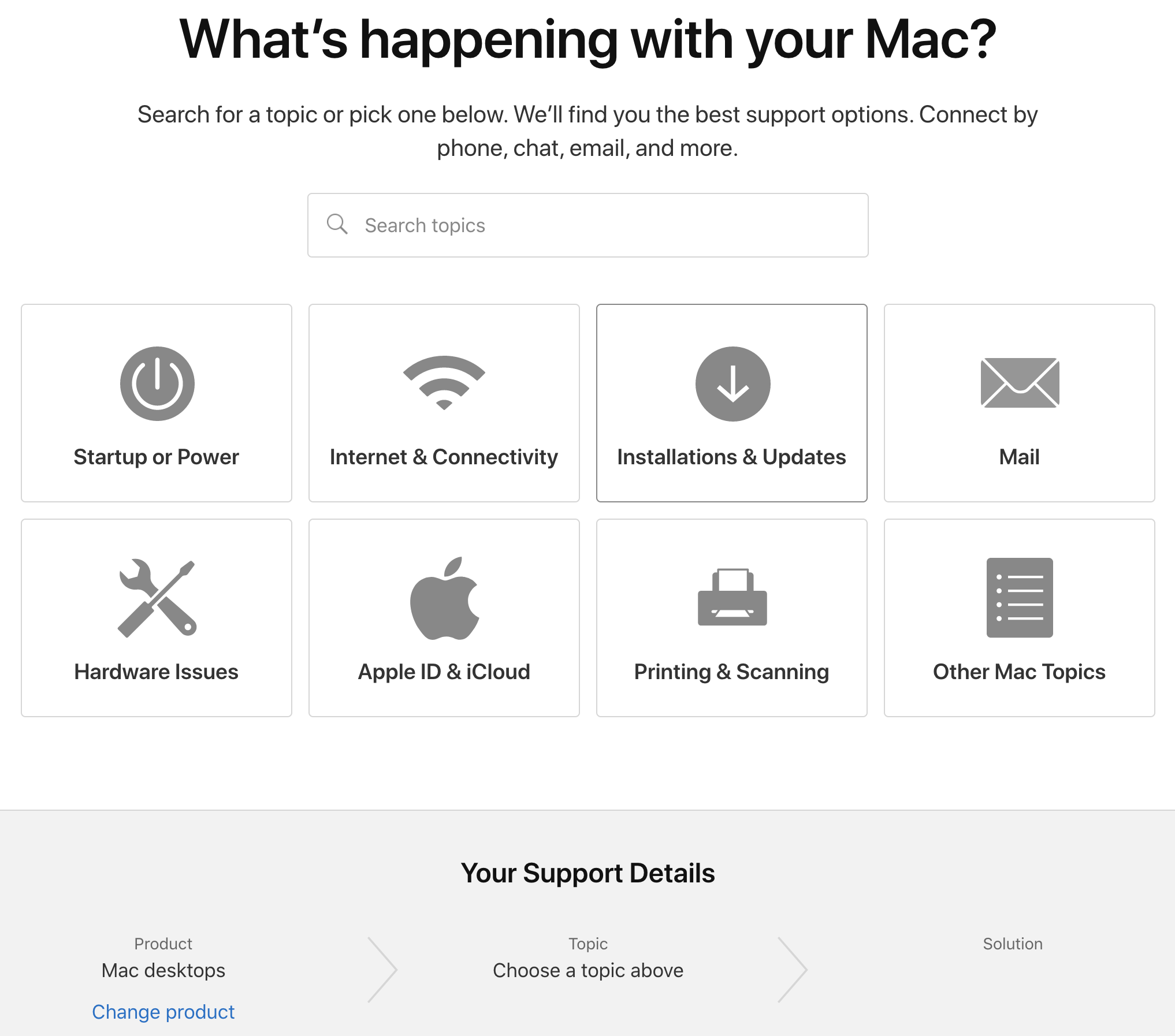
Google and Apple allow users to easily and quickly navigate through their vast array of offerings
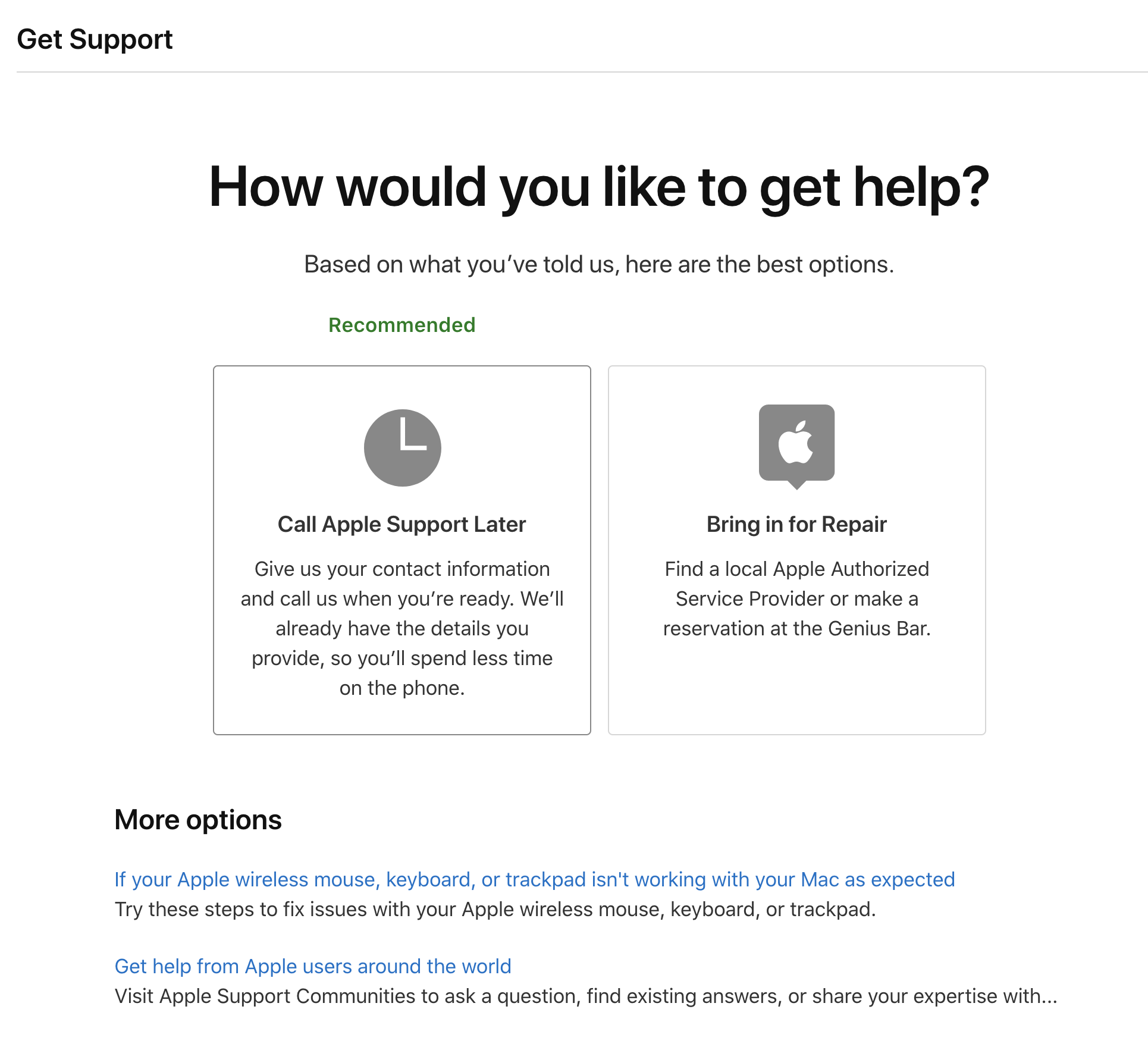
Apple lets the customer drill down to the specific support area that they need and even gives them contact options for convenience
Turbotax manages to make complicated and stressful taxes quick and painless
Uber allows the person to know exactly who is working on their order, where it is in the process, and the estimated delivery time
Activity Summary
We looked at other companies for inspiration and these were our favorites:
Way-finding: Apple and Google
Intuitive forms: Turbotax
Status updates: Uber
Customer service: Apple
DEFINE
We wanted to have a clear view of the problem, the goal, and the users.
Understand the users
Identify the target user.
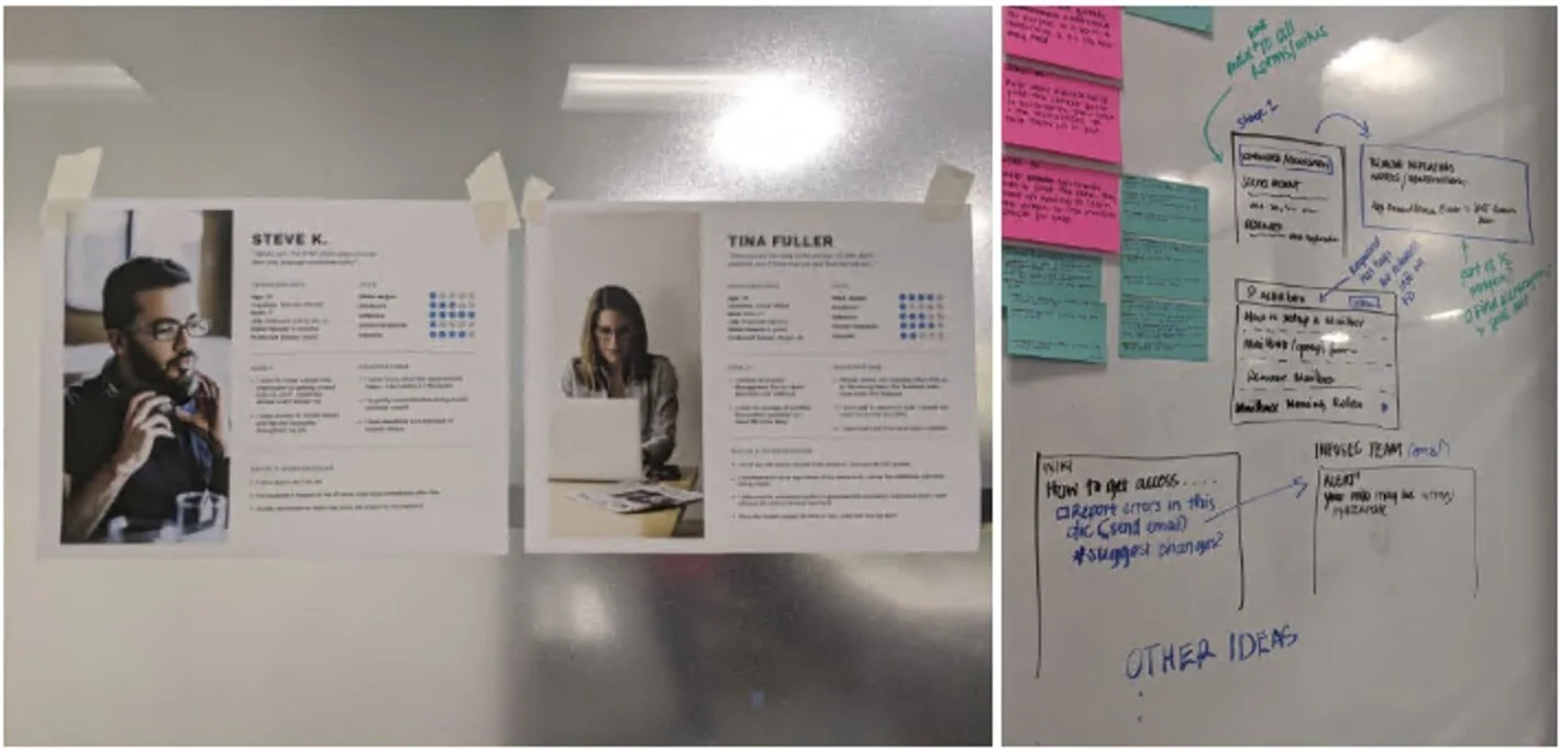
I started to create personas, a journey map, empathy map, and the ideal experience. This proved to be difficult because we still haven’t been able to sit down with customers and really hear their perspectives.
Below are my first attempts at creating artifacts but the actual request processes were much more complicated.
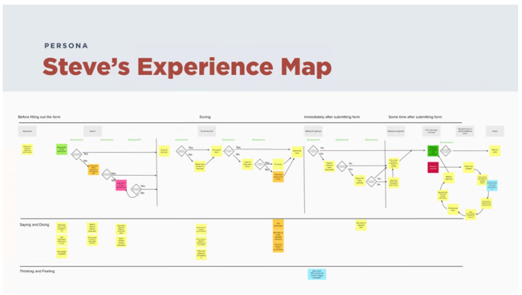
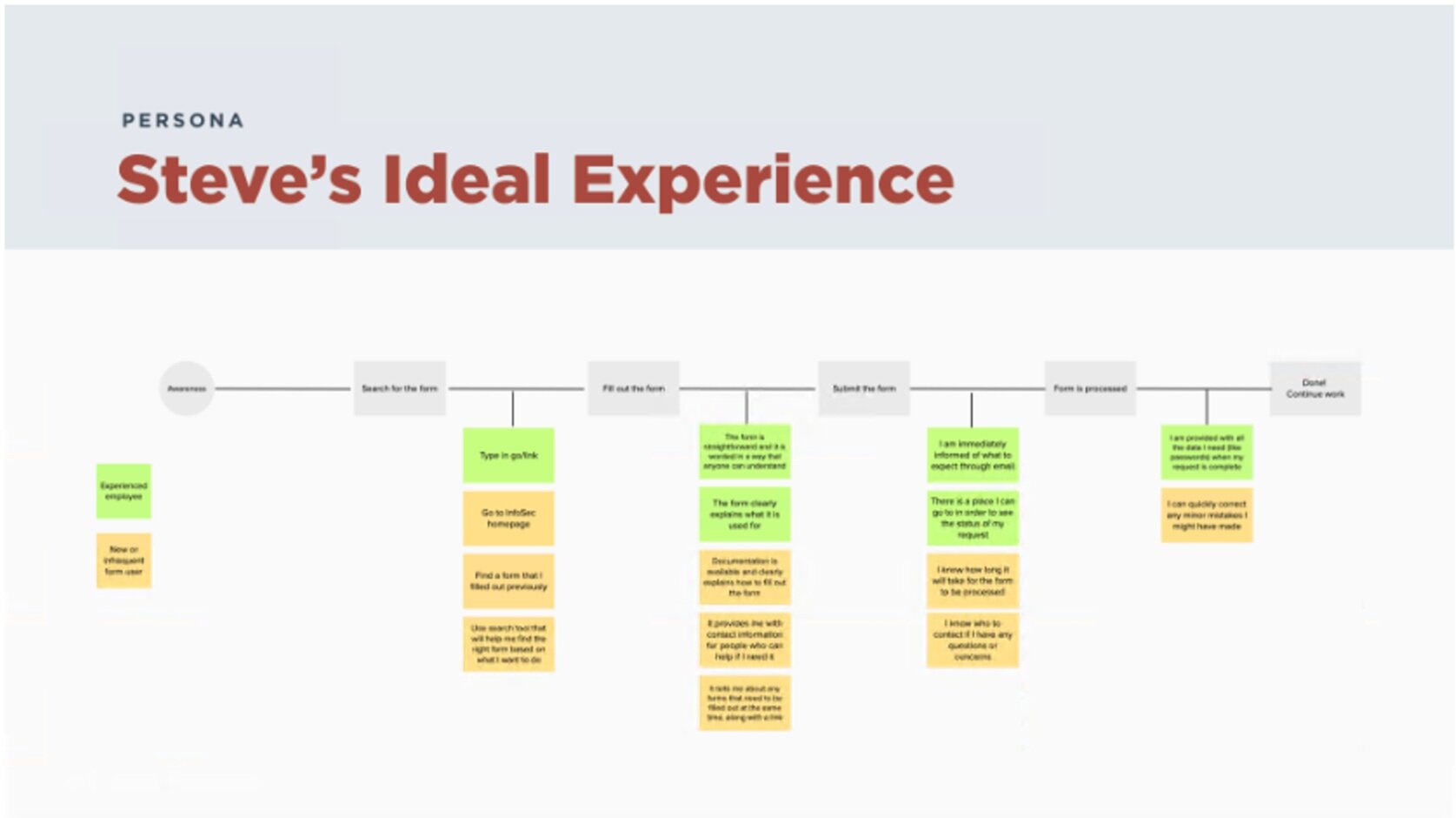
Activity summary
I tried to create various visual representations of the customers’ experience but I still lacked information.
Research objectives workshop
Get the stakeholders to be more involved.
Up until this point, we mostly worked with 2-3 stakeholders on a regular basis but that left us with an incomplete picture. We invited stakeholders from diverse teams to participate in a workshop where everyone helped us fill in various knowledge gaps.
We completed this activity and came up with over 30 questions and then identified the people we wanted to interview to help us answer them.

Activity Summary
To make sure we were solving the right problems moving forward, we invited more than 20 stakeholders to help us come up with a research plan.
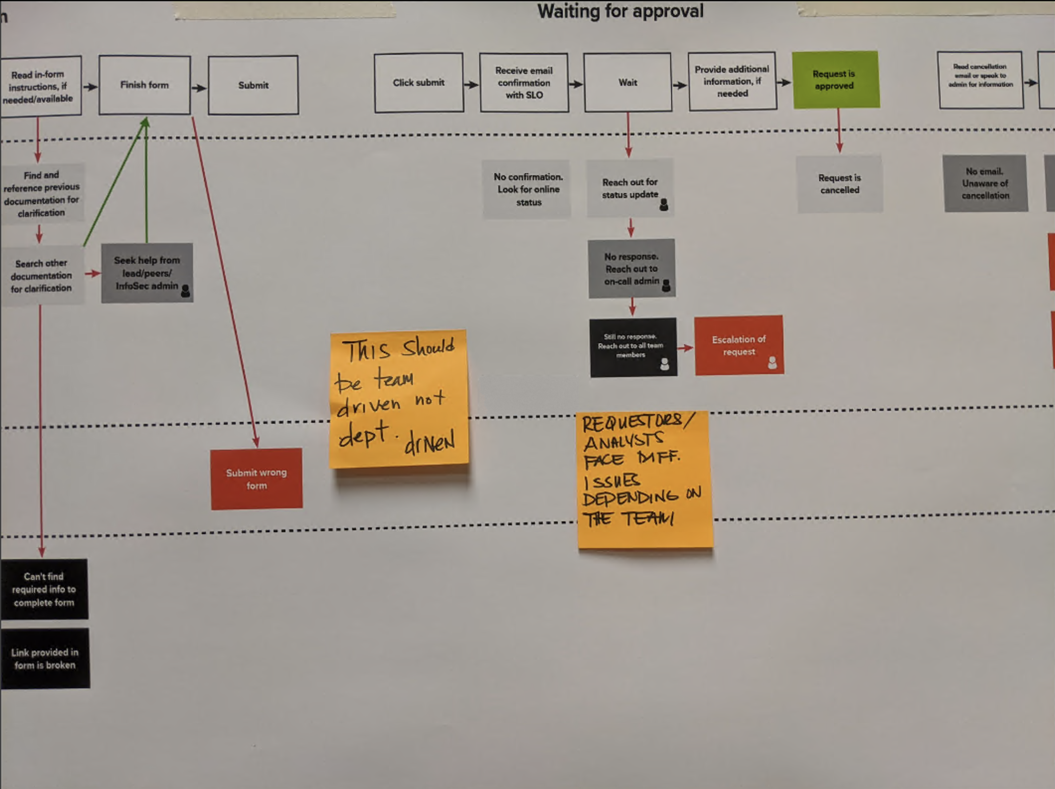
Interviews and contextual inquiries
I created a test plan and recruited participants.
I used the workshop data to define our recruitment criteria. In less than 2 weeks, I interviewed 6 stakeholders and 11 customers to understand processes and pain points from both sides.
I used structured notes during interviews for better synthesis.
For each interview, my partner and I took turns moderating and taking notes in a spreadsheet. I cleaned by notes after each interview and assigned predefined themes to each one so we could combine and sort them at the end.
The structured notes template made it easier for us to transfer more than 300 unique notes onto Mural to group and draft insights. The research findings also allowed me to improve on my previous journey map.


CUSTOMER Quote
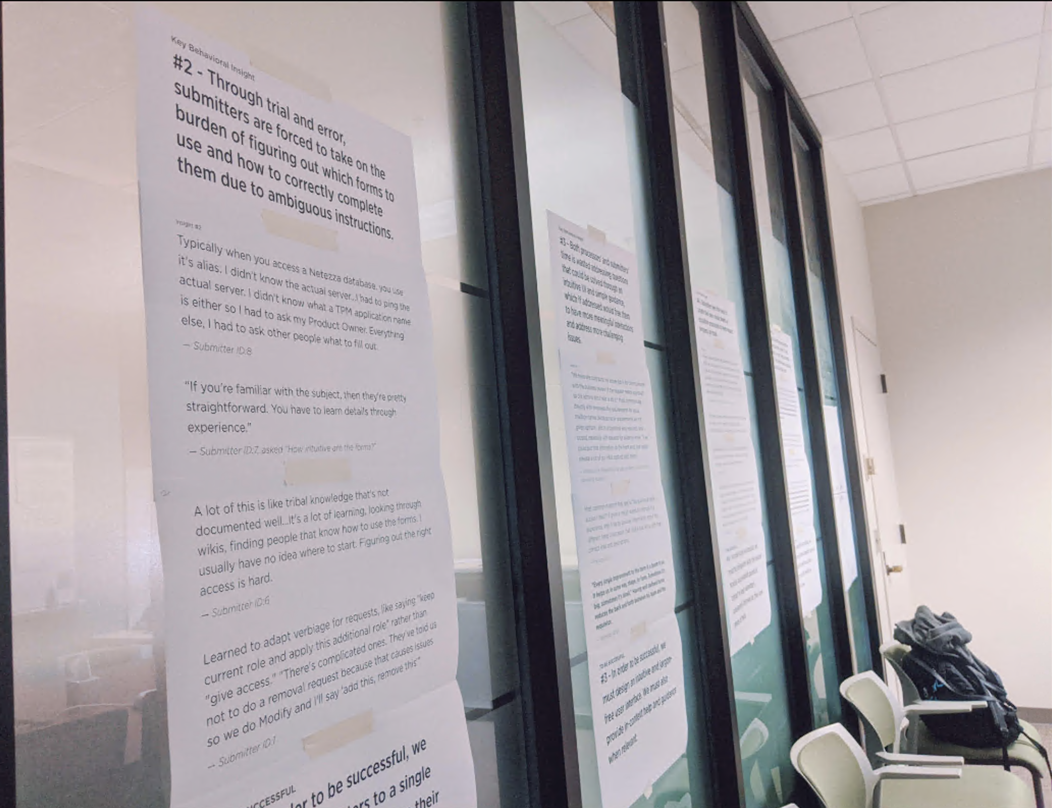
A lot of this is like tribal knowledge that's not documented well...It's a lot of learning, looking through wikis, finding people that know how to use the forms. I usually have no idea where to start. Figuring out the right access is hard.
Processor quote
The form has a lot of free text fields so the requestor can put a different role or multiple roles instead of actually selecting the roles. They can mistype them or request off-the-wall things. We also had an expedite process but it was taken advantage of by the enterprise.
Activity Summary
I interviewed 17 stakeholders and customers and used some fancy Excel tricks to organize all that new information. I was able to finish my journey map and came up with ideas for designs.
Designs
Jobs to be done.
I wrote various jobs to be done based on real customer feedback we got from our research. We combined them with user personas to make sure that we kept user needs top of mind while we brainstorm designs.
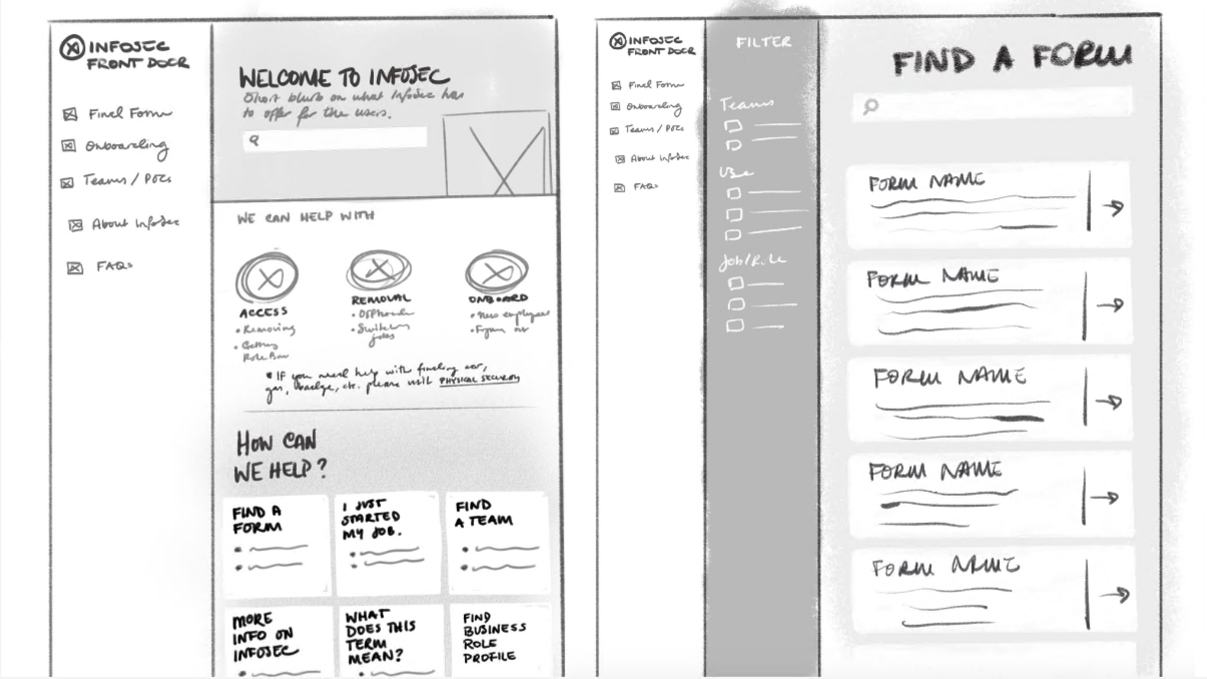
First design concepts for the home page and iterations after getting team feedback.
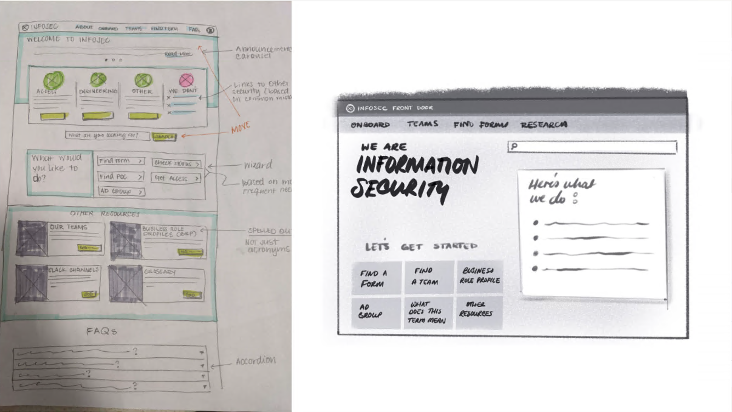
Activity summary
We wanted to come up with as many ideas as possible before refining our designs. Our initial designs focused on providing the visitor enough information to quickly let them know that they’re in the right place and help them find what they need.
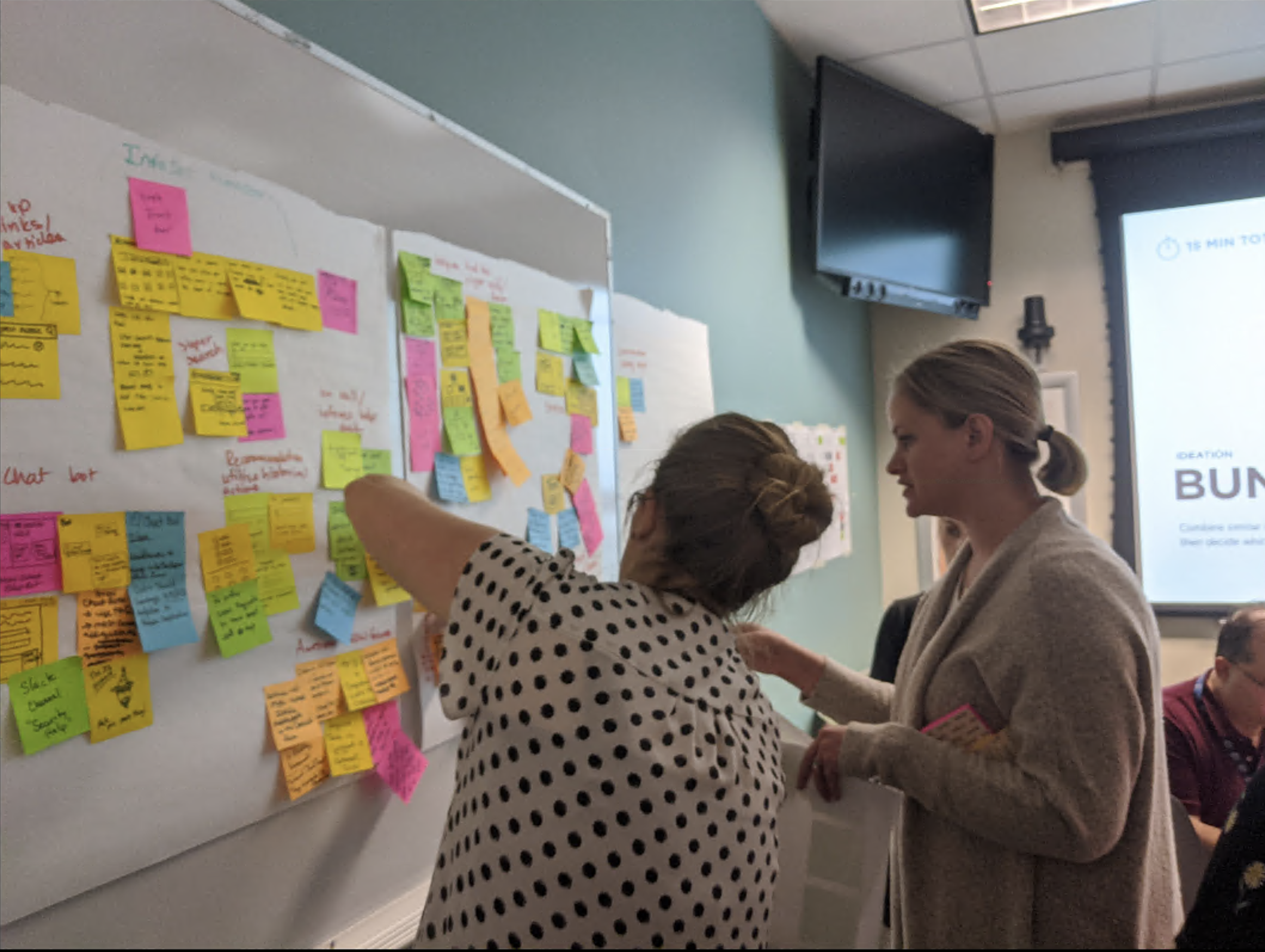
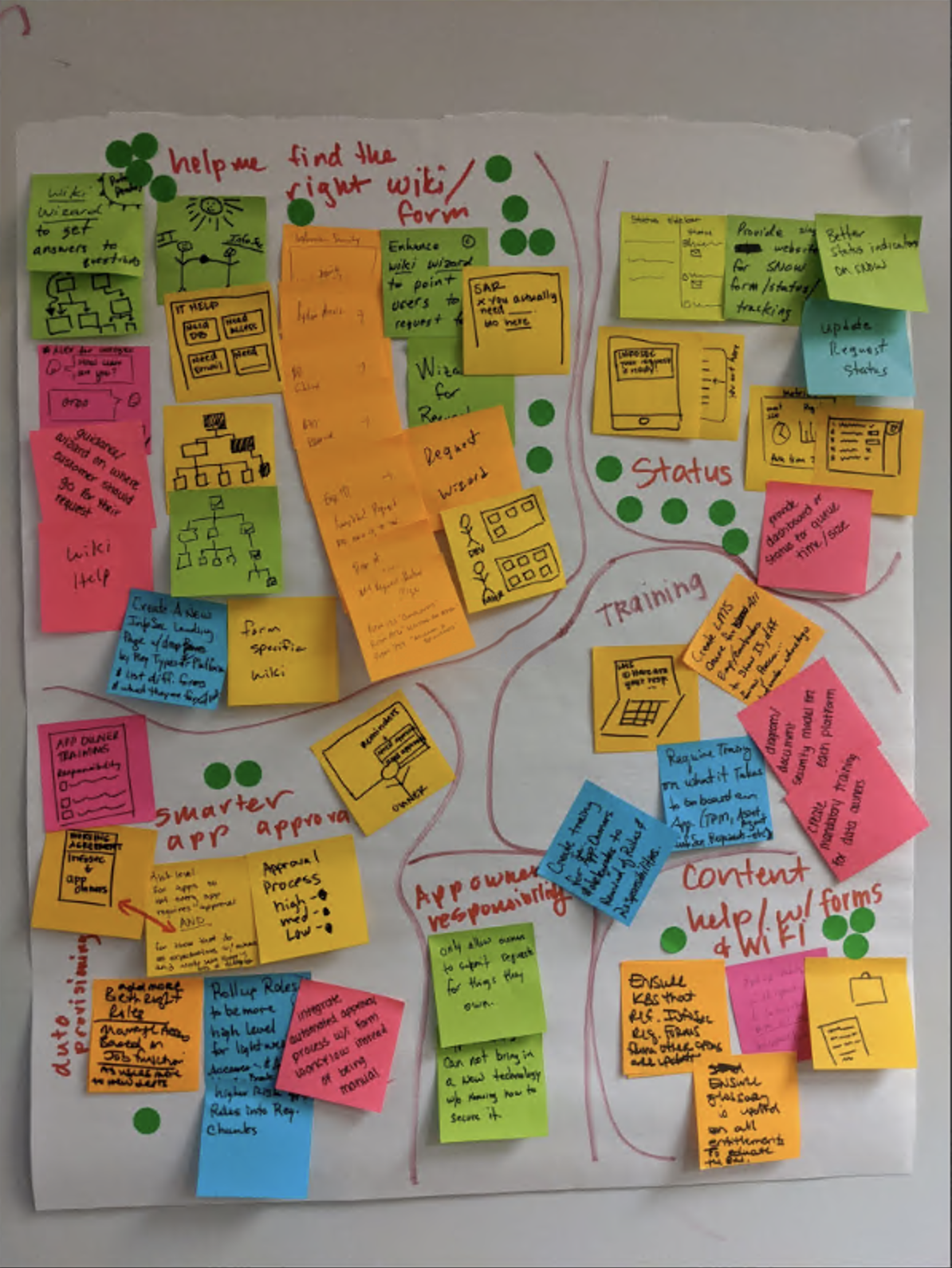
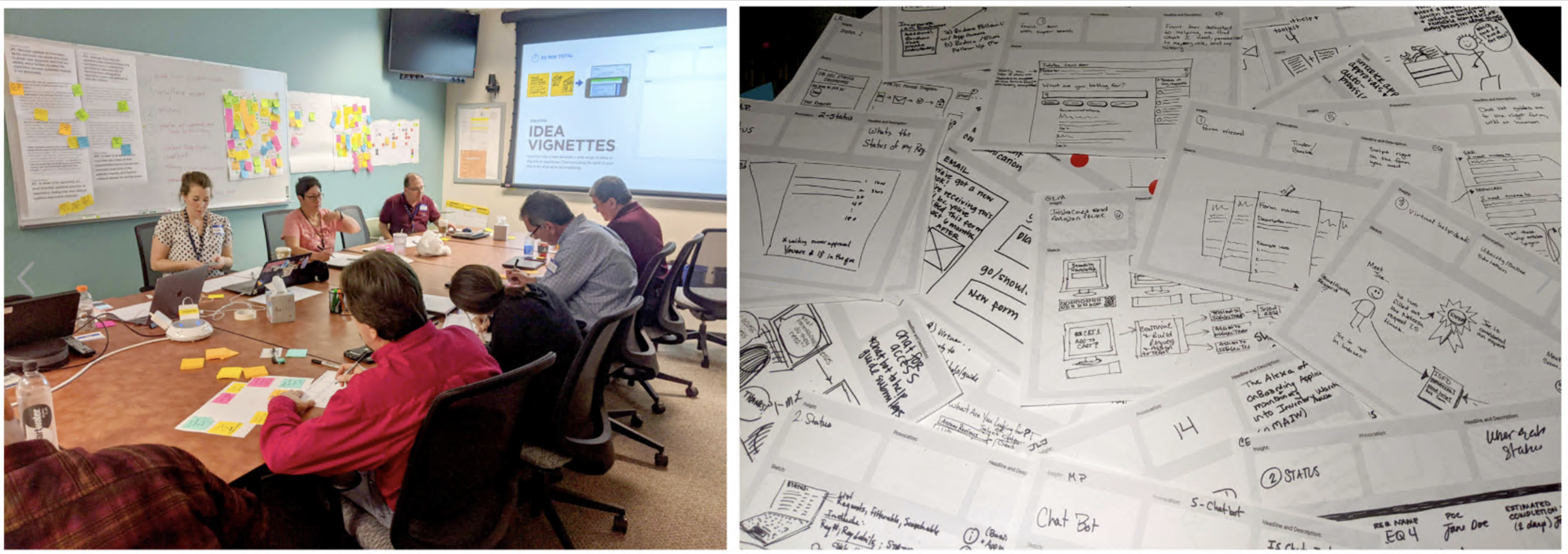
Workshops
We came up with designs based on the information we found but we were still missing a critical piece: the actual process workflow. We organized a vignette workshop where we invited stakeholders to help us ideate solutions that go beyond feasibility. We did this to generate ideas on how to improve on the front door experience.
Immersion:
We walked stakeholders through our research findings and allow them to talk about them to discuss or clarify on anything. We printed out customer quotes and insights and the journey map.
Generating ideas. Crazy 8’s. Grouping ideas. Dot voting.
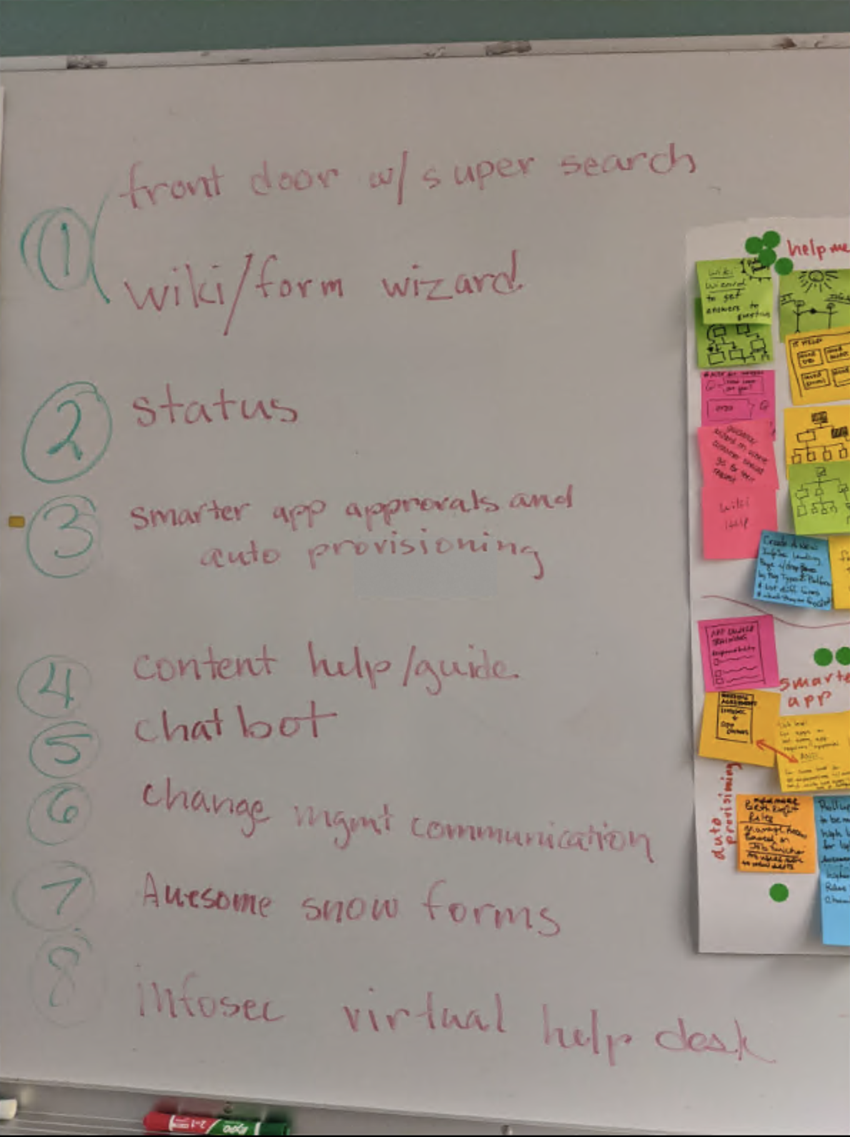
Experience based roadmap
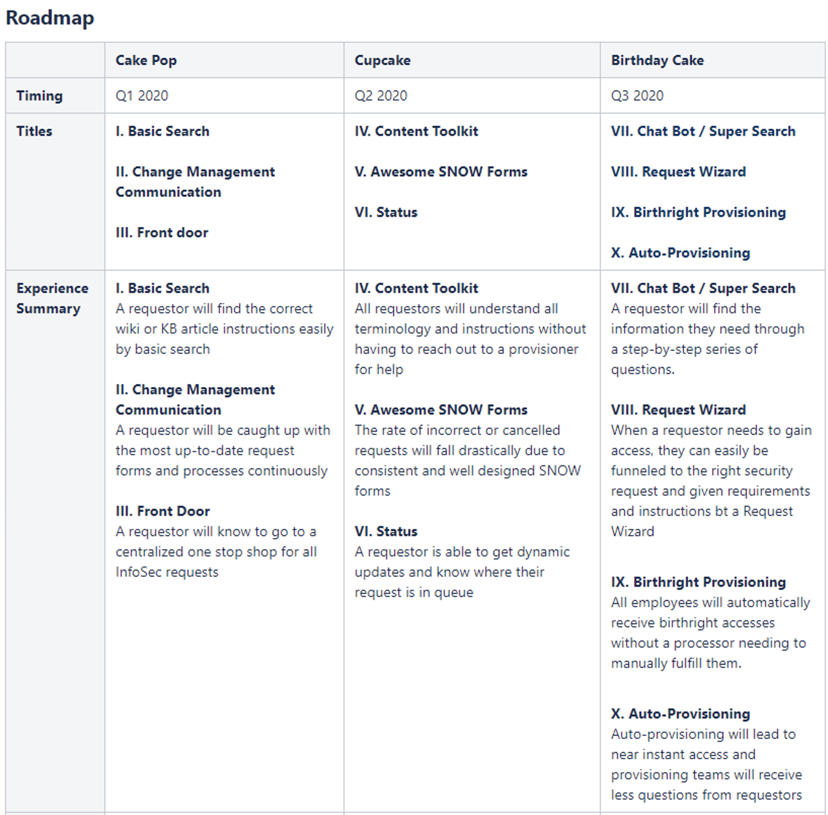
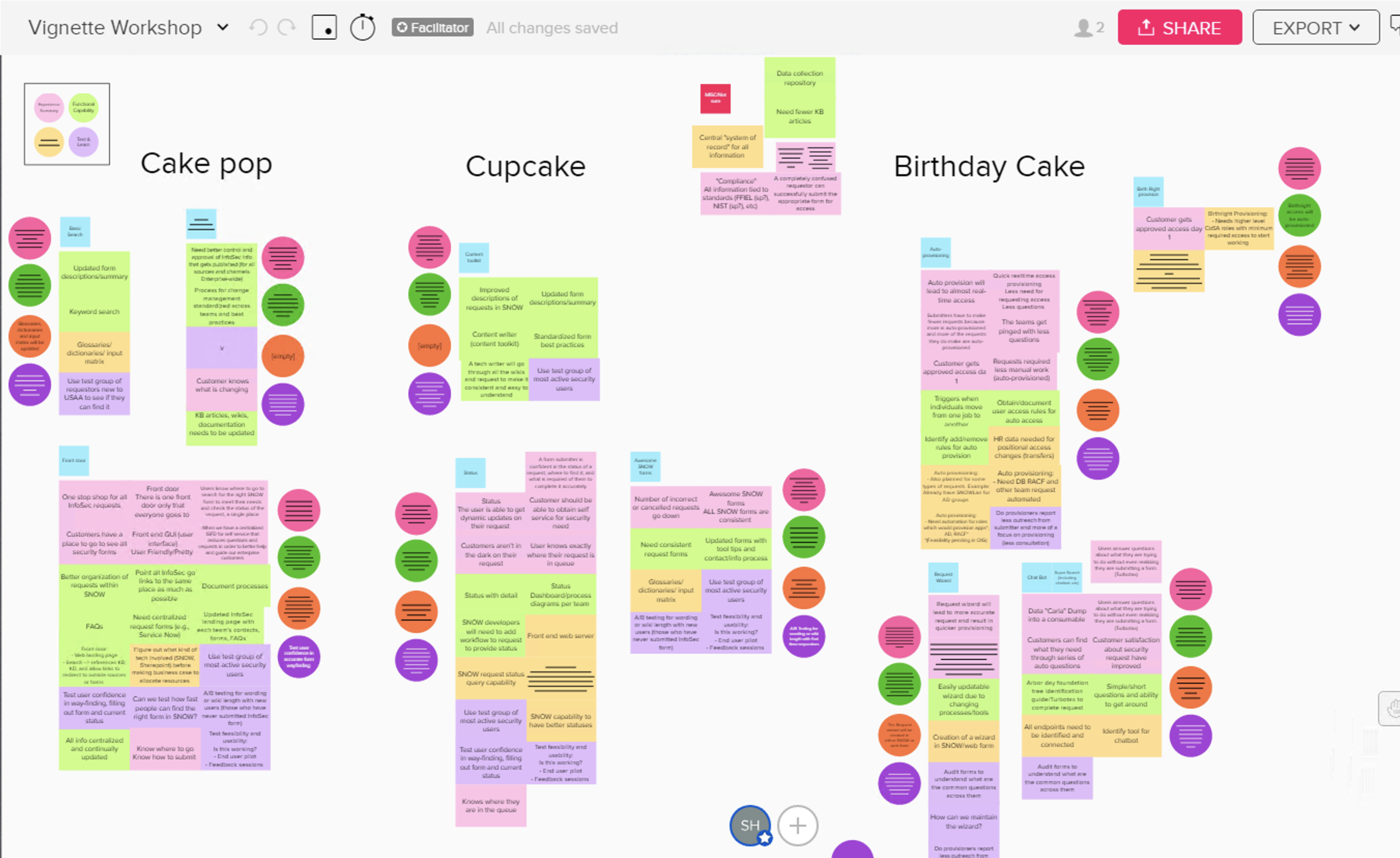
Activity Summary
Research
Business case
We were still having difficulty getting the ball rolling. We wanted to create a business case:
I think sometimes business doesn't want to update things because they're afraid things will break. There are areas that are scared to death of things breaking but when it gets to the very end, it gets to a point where you can't even upgrade anymore. You have to rewrite the entire thing or buy another product. And they have to keep old technology around just to keep applications running. That old tech become unsafe with Cyber Security. So that puts us in a bind. Who's gonna give?
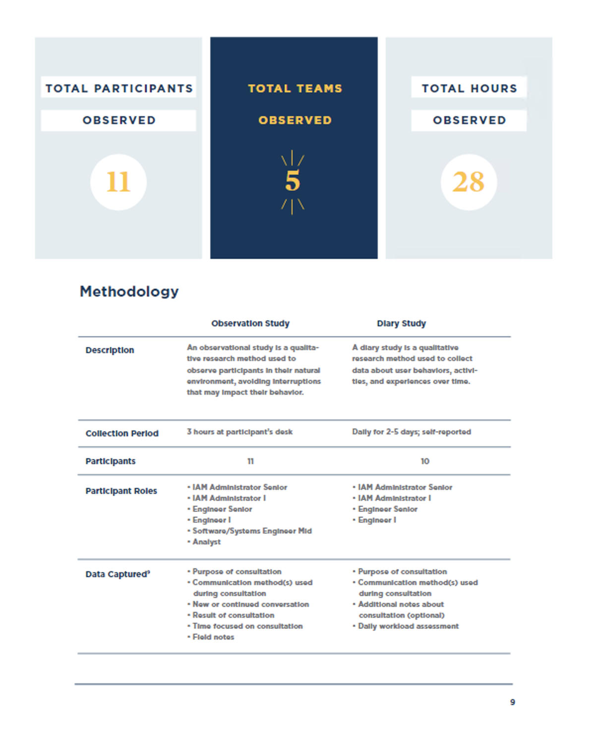
Observations and diary studies
Observations gave us insight into details, diary more longitudinal
Structured notes. Before and after cleaning notes.
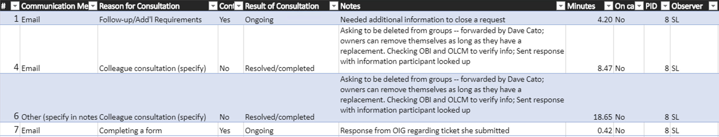
Results: observation and diary data consistent
Unexpected outcomes: calendar invite, spring break.
Visualize data
Meet with data person - she gave us employee salary info to quantify
Want to make it compelling
WHITE PAPER
Insights?
Activity Summary
Collaborative design Activities
In person whiteboarding - Whiteboarding and design collaboration on wireframes
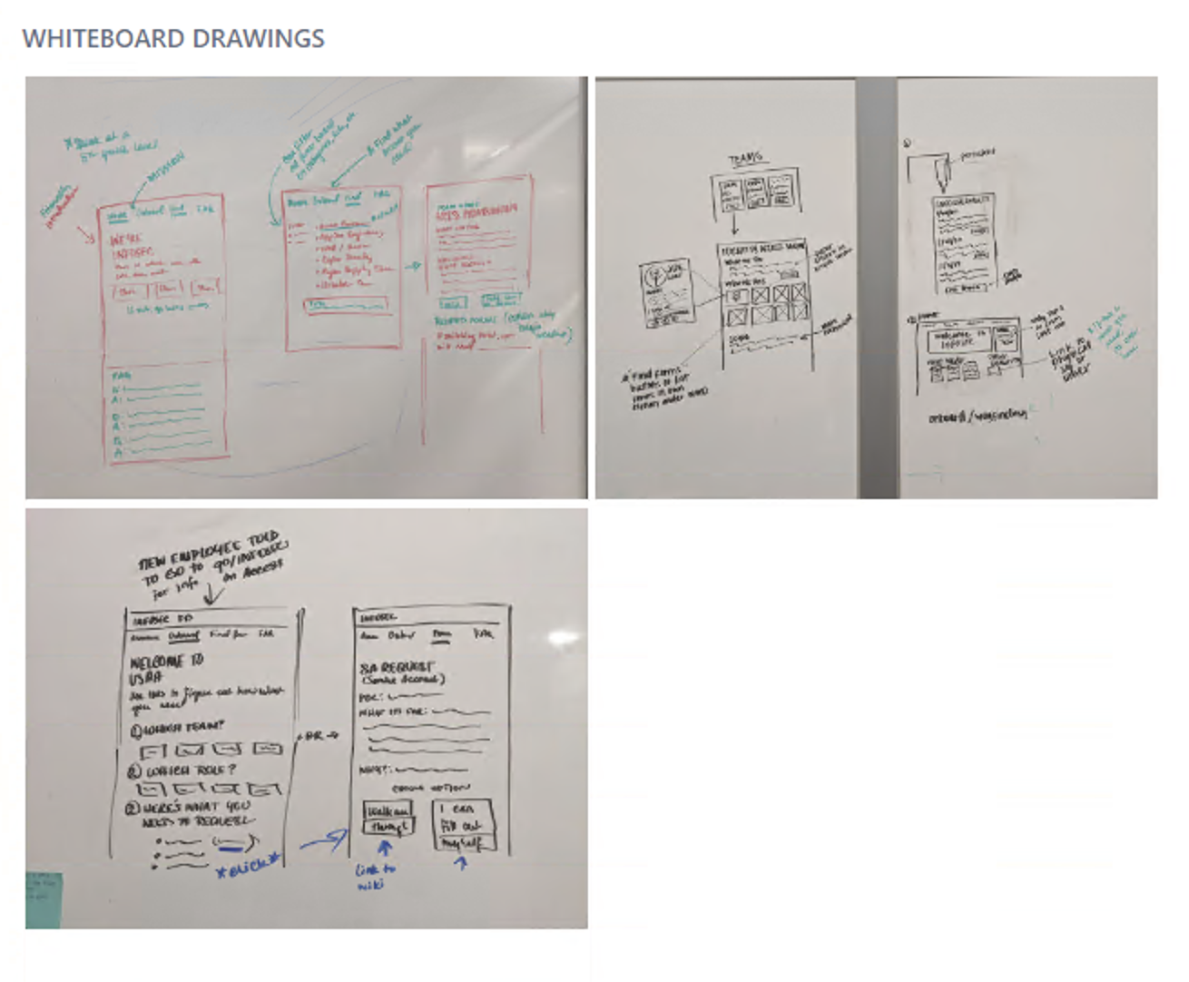
Remote whiteboarding
Information Architecture
IA Consultation
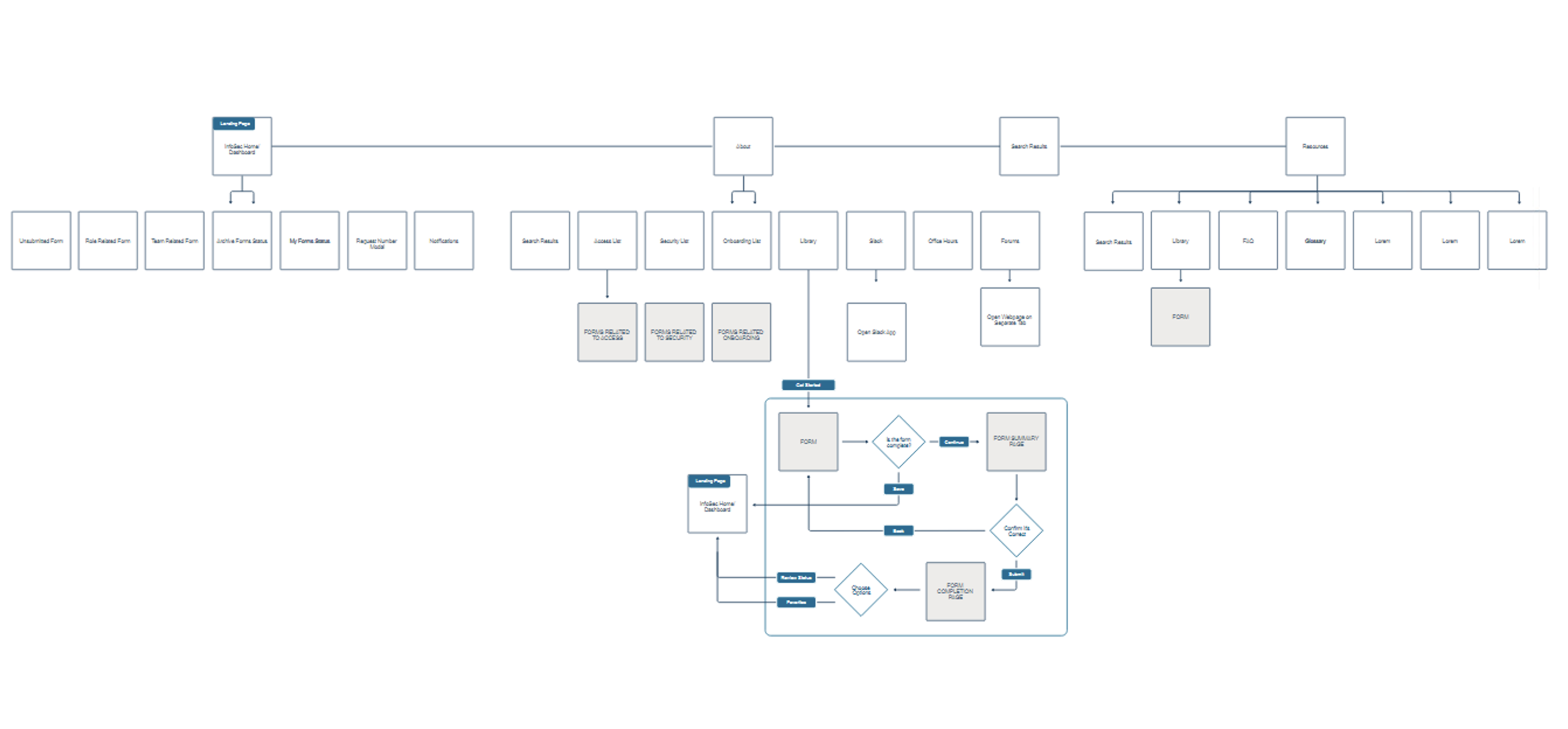
Activity Summary
Design decisions
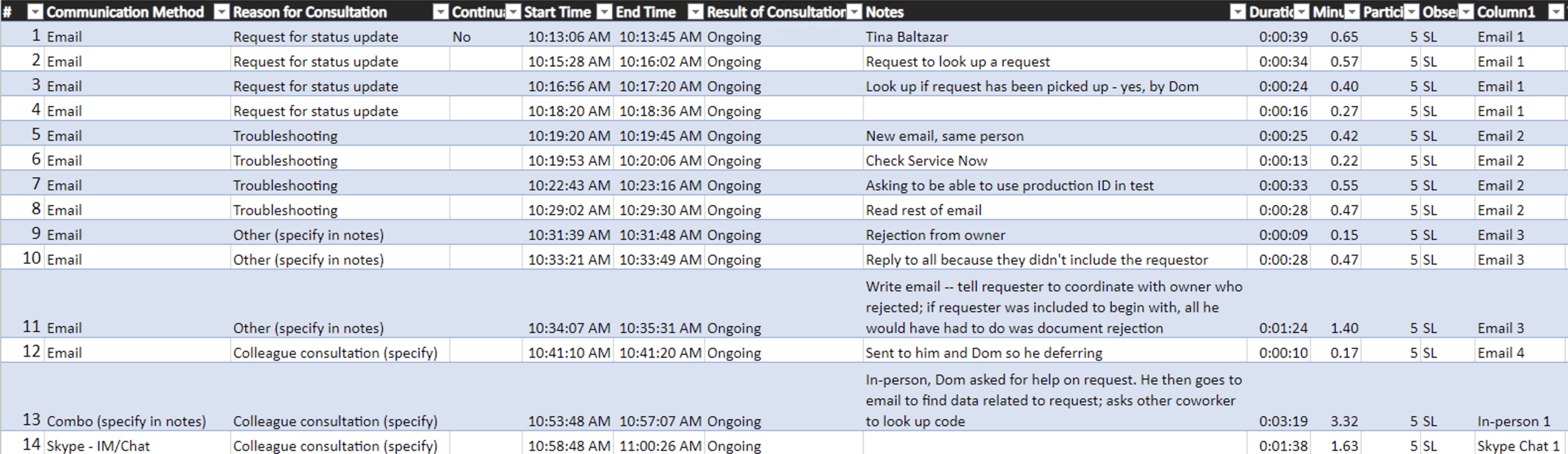
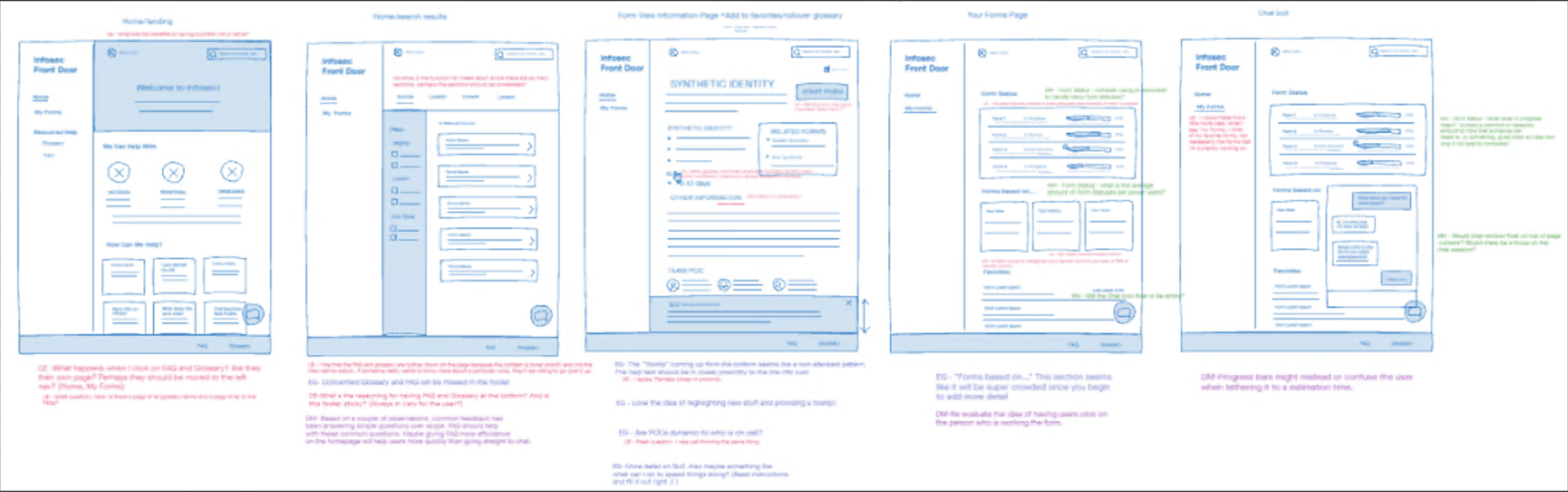
Hifi designs — based on Experience based roadmap
Chatbot
Homepage
Wizard
Find help
Form list
Super search
*Label sections and design decisions